

Transcripted Summary
We're going to start off this course by looking at some interesting cases that can come up as you start to test more and more of your webpages with the Ultrafast Grid and the Applitools Visual AI.
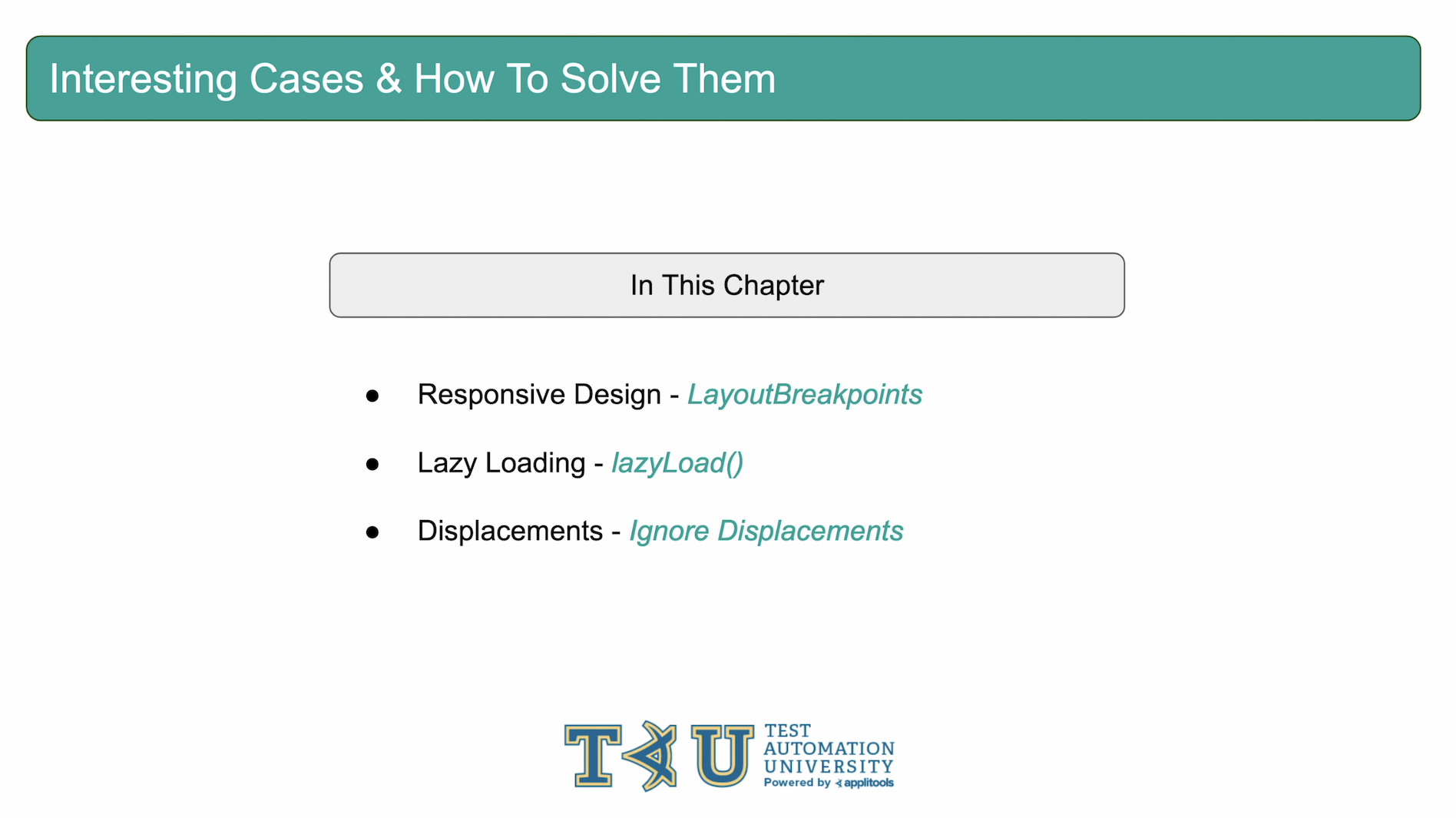
The 3 cases we're going to cover are pages that have responsive design, pages that use lazy loading and pages that have intermittent shifts of their content. All of them can be easily handled with built in features from the Applitools SDKs. For each of these issues, we'll show you how to recognize the issue as well as the steps to resolve it. Let's jump right into our first example, responsive design.
Before we jump into any code, I wanted to flag that we'll be using the same Github repo as the previous courses and building off of where we left off. Like last time, I will place the link to this Github repo in the write-up down below. In the first course of this series I walked through how to set this project up. Please be sure to go back and review that section if you haven't already set this project up on your own machine.

In this repo, I've set up a number of branches in this project that correspond to the code changes that we've made throughout this course. Feel free to use these branches as a reference as our project continues to evolve. The last course left off with version_24-GithubIntegration. If you didn't work through the last course, feel free to move directly into this branch so that you're all caught up.
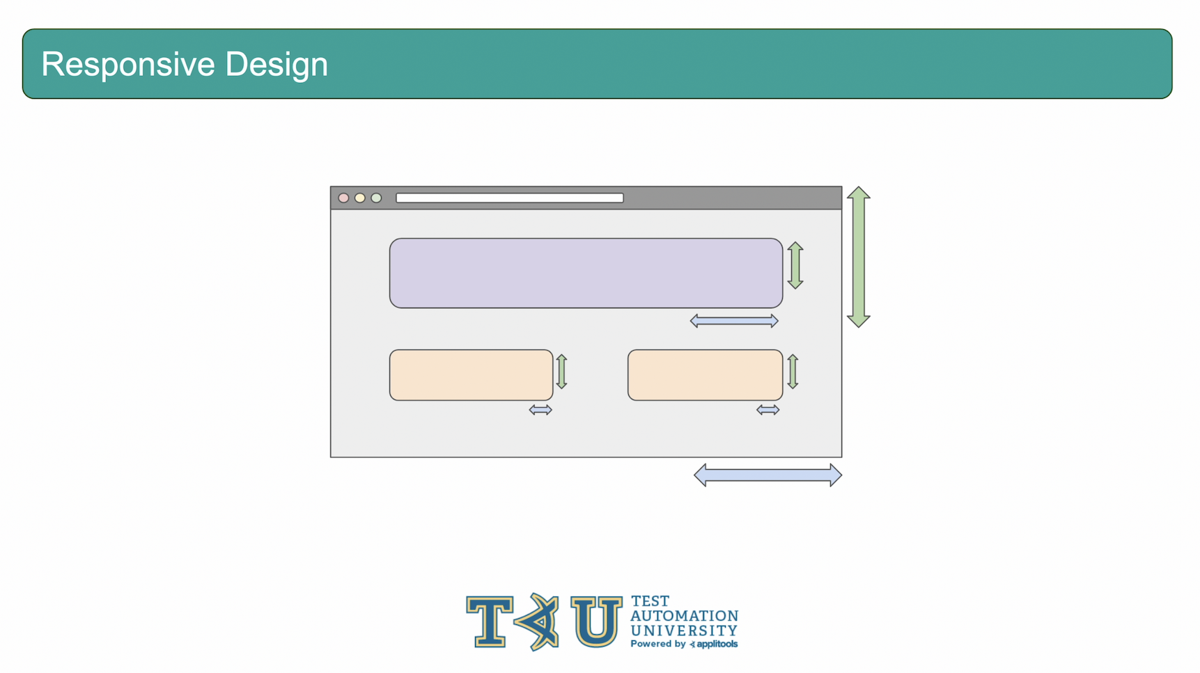
In the first section of this chapter, we're going to look at what may happen if your page uses responsive design. Responsive design is when your page changes the size of the elements on the page or the overall layout of the page based on the dimensions of the browser. For example, we've all seen pages that look completely different on a mobile sized viewport vs. a desktop viewport. That is responsive design at work.
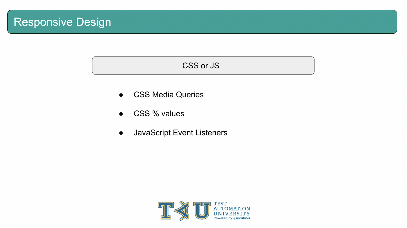
There are a few different ways that a site could implement responsive design but the main ones are using CSS with media queries or percentage values or using JavaScript Event Listeners.
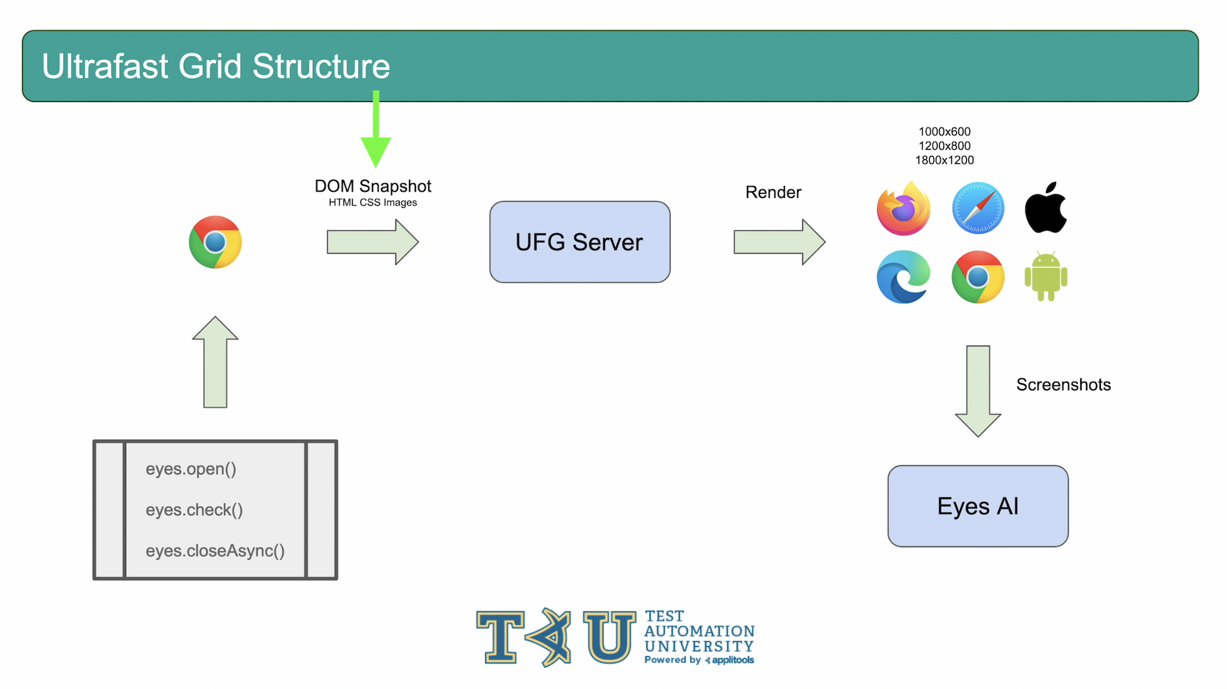
If you remember back in course 1 of this series - the basics of visual testing - we went in depth on how the Ultrafast Grid works. We saw how the Applitools SDK gathers all of the resources from the driver you're running your tests on and compiles them into what's known as a DOM Snapshot. The Applitools SDK then sends the DOM Snapshot to the Ultrafast Grid for rendering across all the different environments that you've specified in your SDK configuration. If you don't remember this concept or haven't taken that course yet I highly recommend going back to review before moving forward with this section.
If your page uses CSS to implement responsive design then there won't be any issues since the CSS is sent as part of the DOM Snapshot. However, JavaScript is not sent to the Ultrafast Grid as part of the DOM Snapshot. If your page uses JavaScript for responsive design, your renderings can sometimes look incorrect.
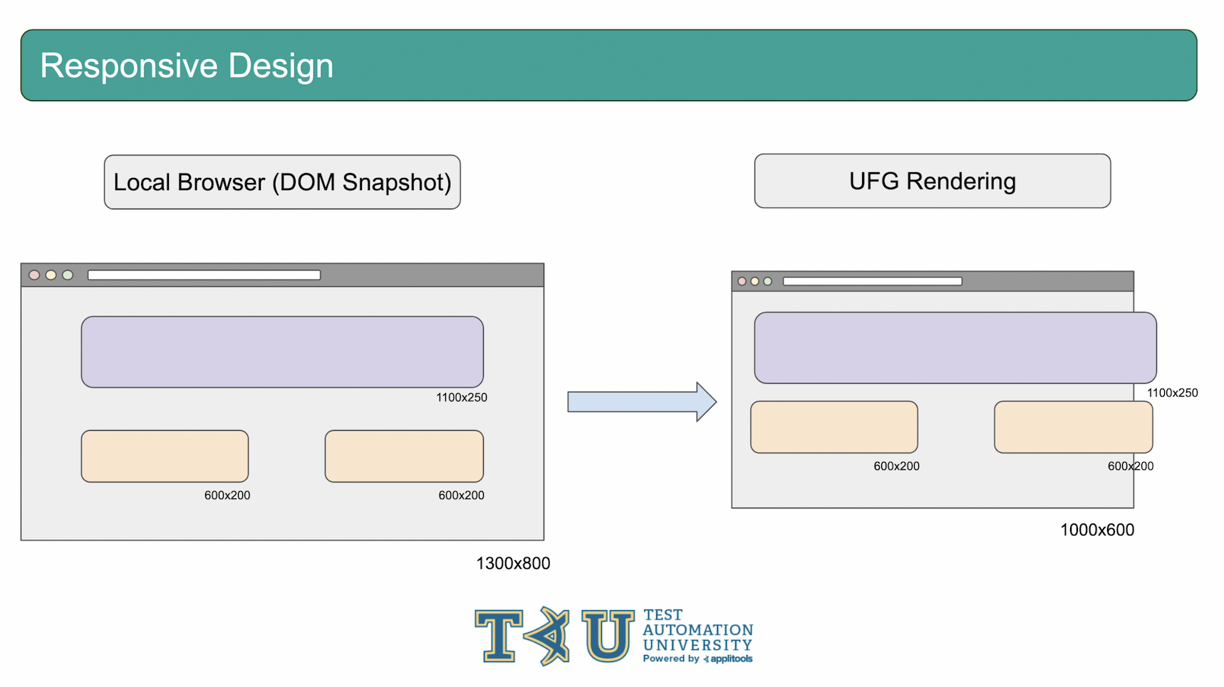
This could be a problem because we're capturing the DOM Snapshot only on one environment locally. Therefore, the DOM Snapshot will send all the elements in their current state based on the width and height of the local browser. Then, on the Ultrafast Grid side, if the JavaScript logic is not present to resize those values based on the current size of the browser that we're rendering on, those elements will stay the same size even if the browser gets larger or smaller. This can result in situations like this where the elements are too large for the viewport that we're rendering on.

So, what can we do to resolve this problem? We can use a feature called LayoutBreakpoints. LayoutBreakpoints is a configuration option offered by the Applitools SDKs. If enabled, it will instruct the SDK to capture a DOM Snapshot for all of the browser sizes that you're setting in your Ultrafast Grid browser configuration. Then, the Ultrafast Grid will use the DOM snapshot that most closely matches the width that it is currently rendering on. Let's jump into an example to see this in action.

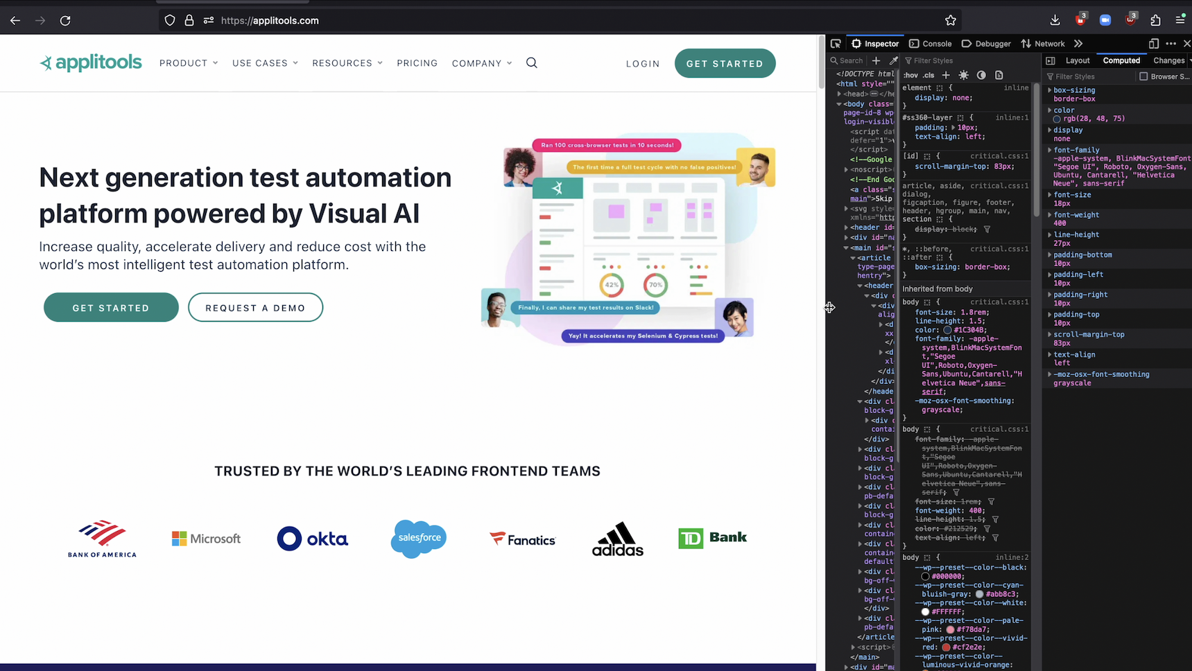
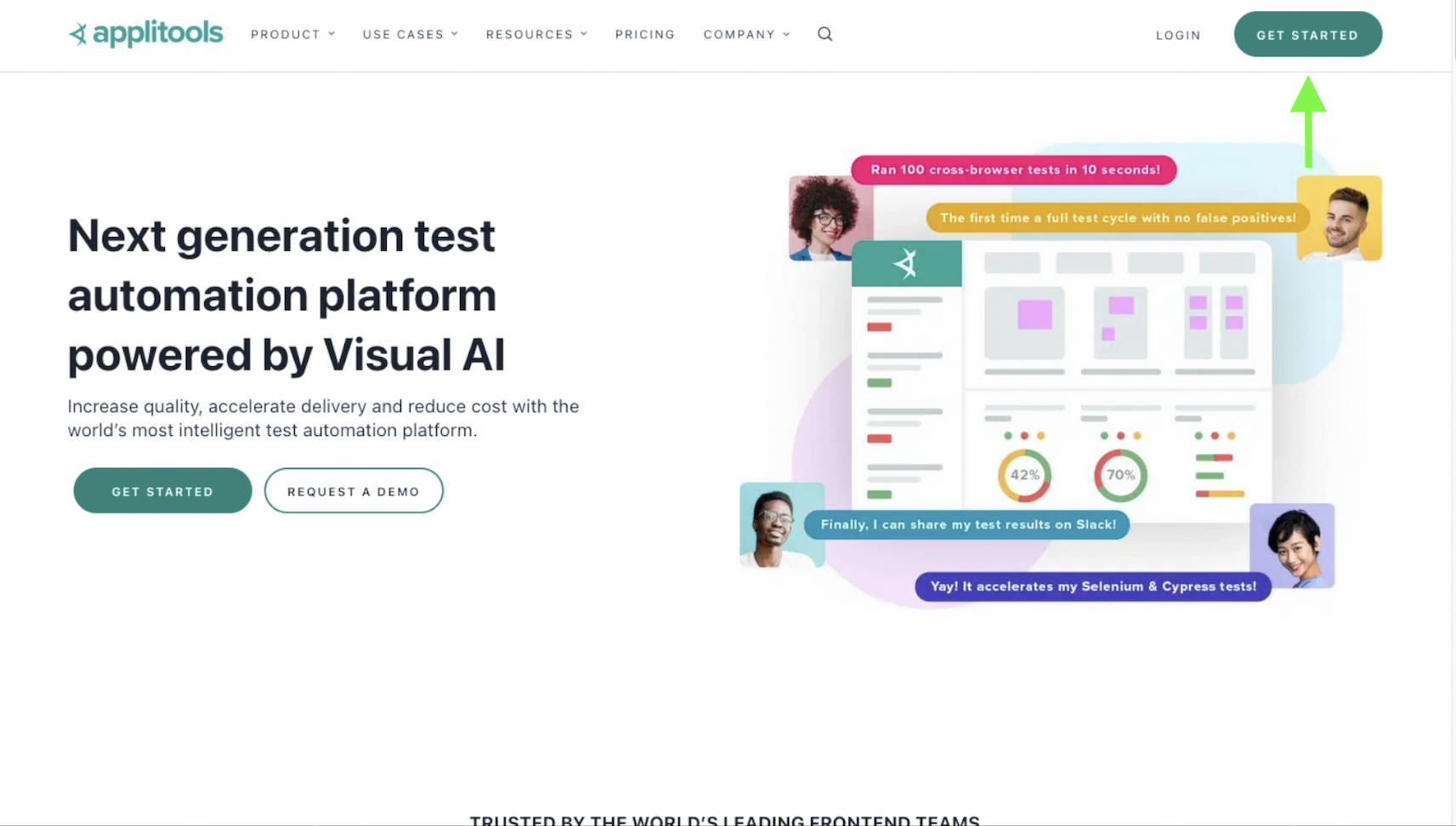
Let's take the Applitools home page as an example. As we can see, as we resize the browser, the navbar at the top of the page changes in style and width. We get the hamburger icon for smaller viewports and for the larger viewports we see all the nav options listed directly in the navbar. Let's head over to our code and set up our test to run on this page.
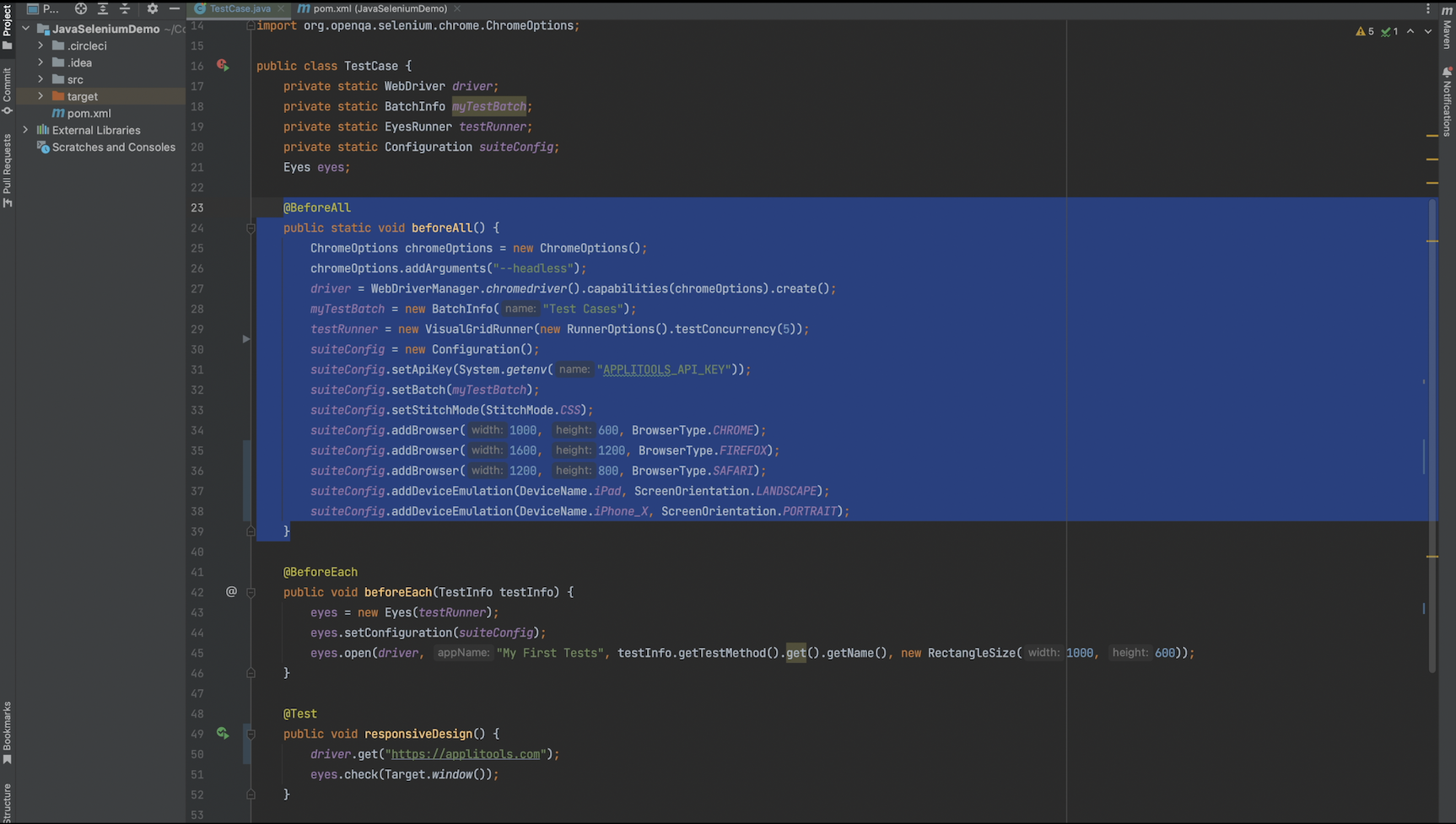
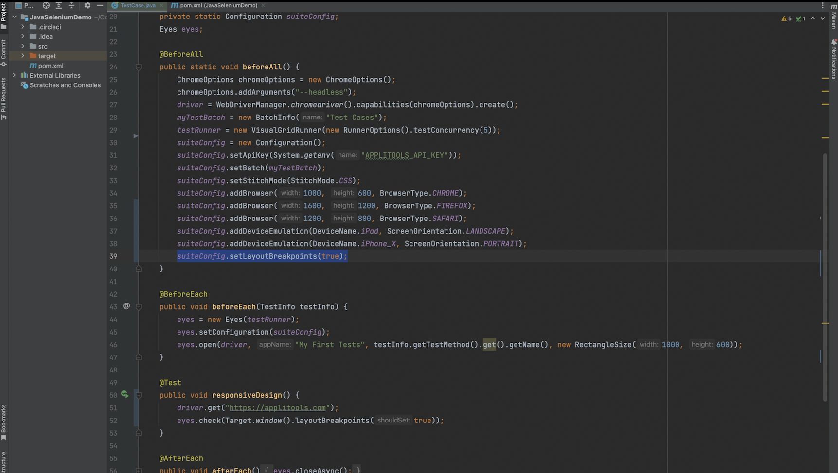
Let's first go over our code and make sure we're on the same page from the previous course. In the beforeAll hook, I'm creating our Chromedriver, our BatchInfo object, our testRunner object and setting up the Configuration for our test.

In the beforeEach hook, I create a new eyes object, apply our Configuration and call eyes.open().
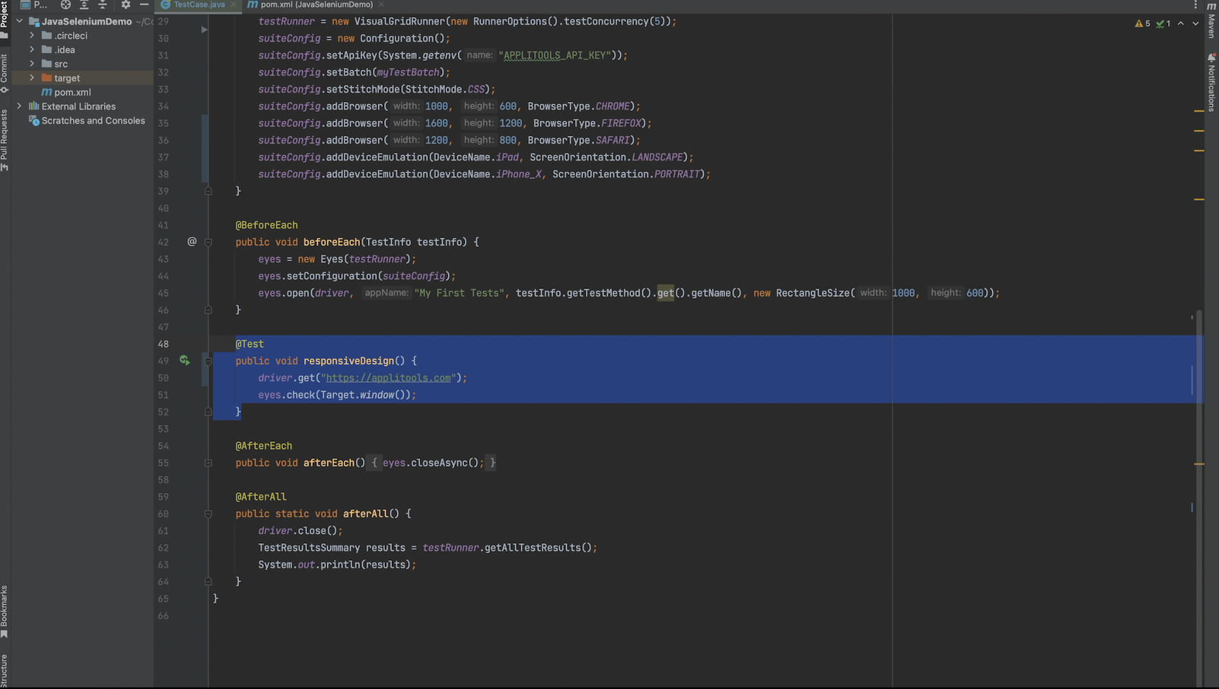
In our test case, I'm navigating to the Applitools homepage as we discussed and then calling eyes.check().

In the afterEach hook, I'm making a single call to eyes.closeAsync().
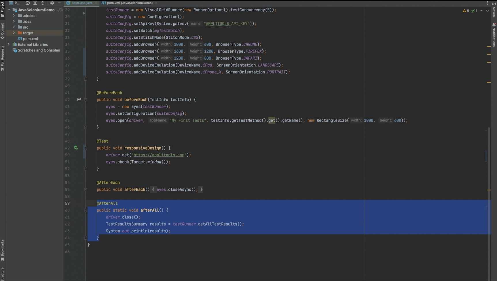
And finally, in the afterAll hook, I'm closing our driver and printing out the test results from our testRunner object.
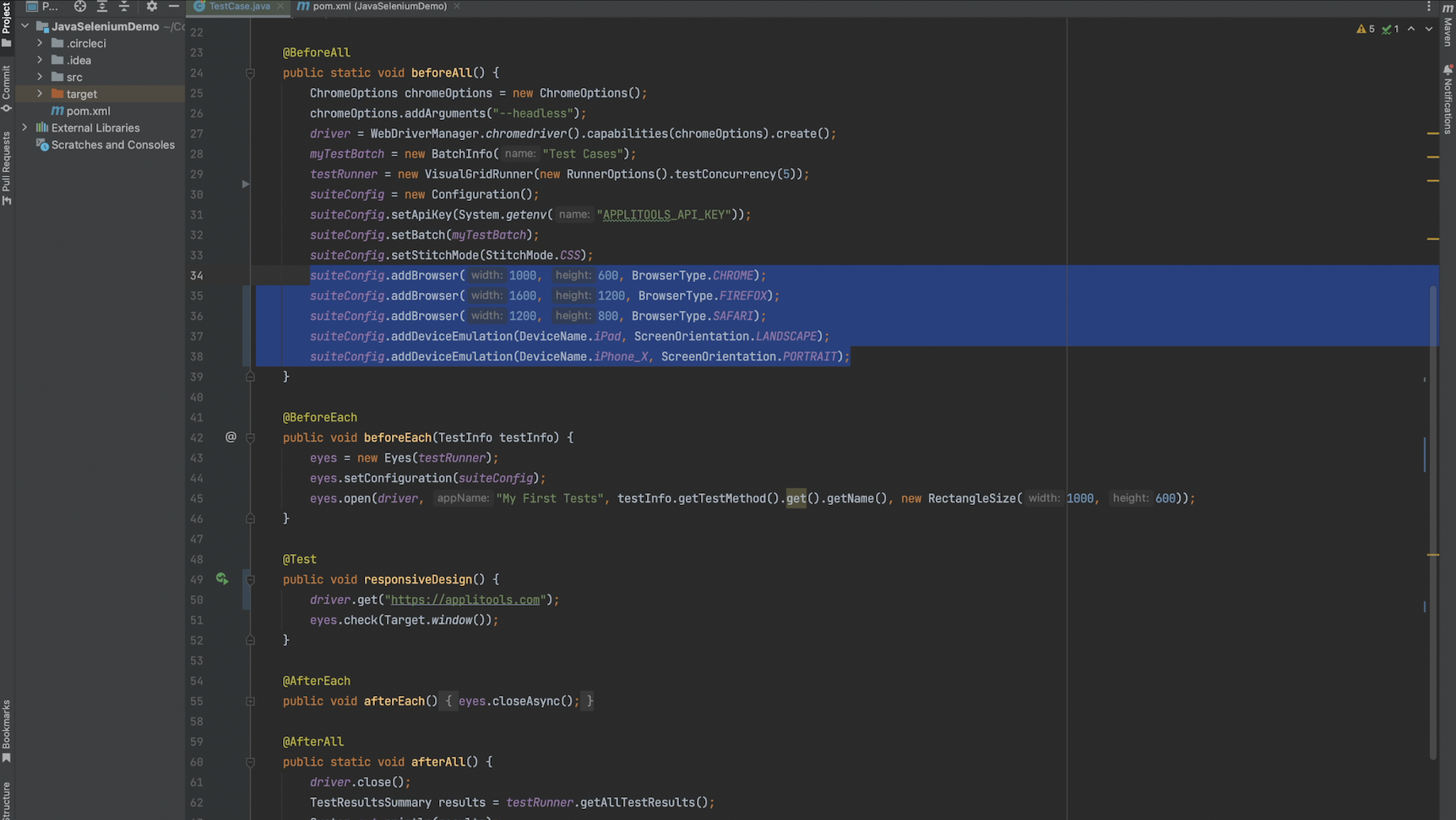
A few specific things to note: I am rendering across 5 different browser environments including desktop, tablet and mobile environments. For this example, be sure to pick at least 2 environments that differ in size such as a mobile or tablet environment and a desktop environment.
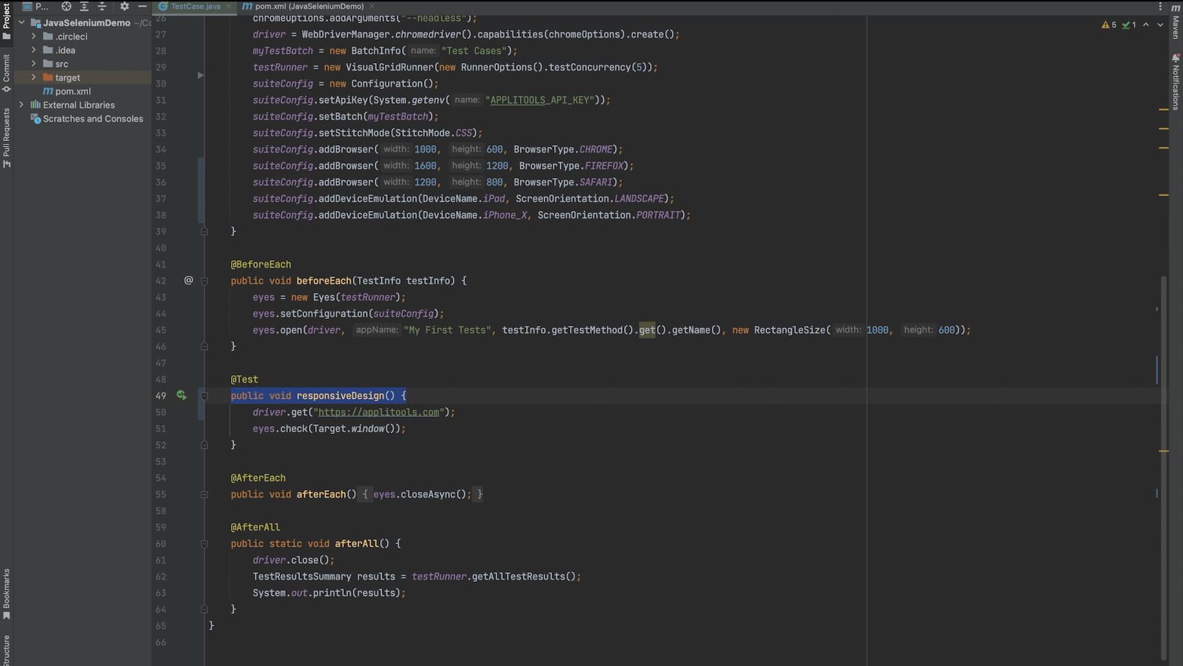
I've also changed the name of our test to responsiveDesign so that we get a fresh baseline to work with. Let's run this test and then analyze the results on the Applitools Test Manager Dashboard.
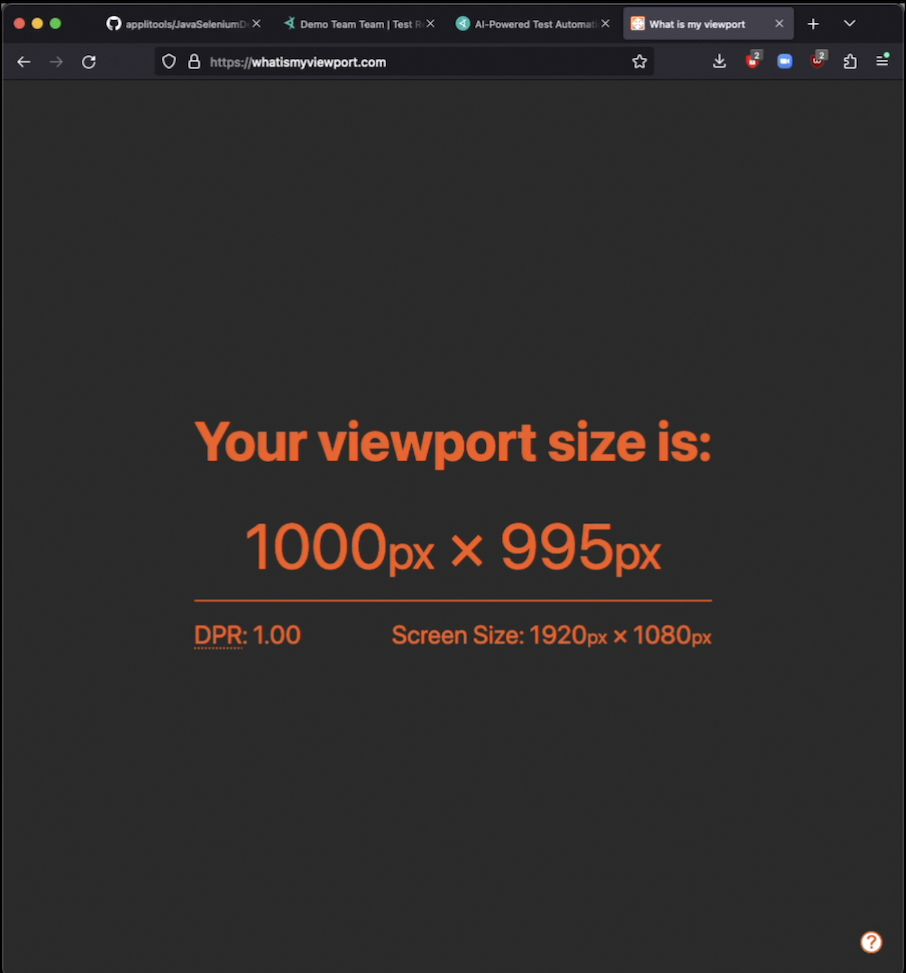
One of our tests is configured to run on a width of 1000. If we resize our browser to this size using this helpful webpage and then take a look at the applitools home page, we can see that we expect to see the hamburger navbar for this test case.
If we look at our test result for our test case of 1000 pixels wide, we can confirm that this page shows up as expected and we see the hamburger nav bar.
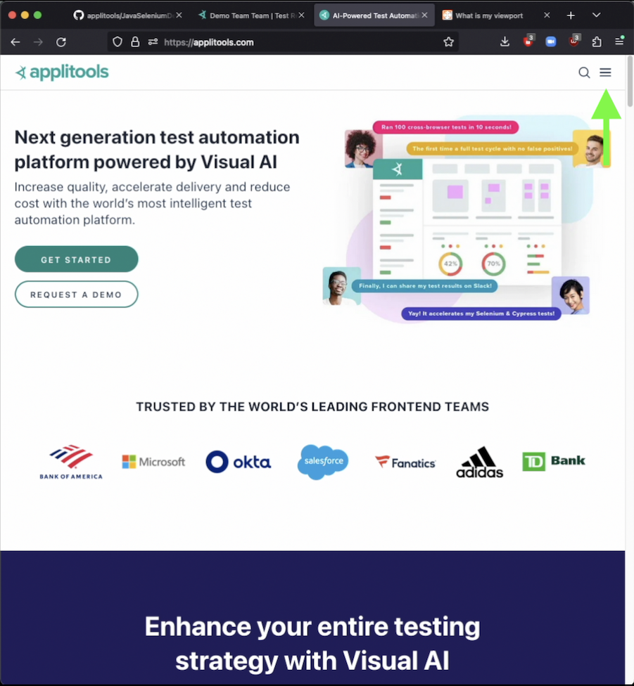
Let's run through that same process for our other test result that has a width of 1600. If we resize our browser again to 1600 pixels and then take a look a the Applitools home page again, we see that in this case we're getting the full navbar. Let's checkout our test result.

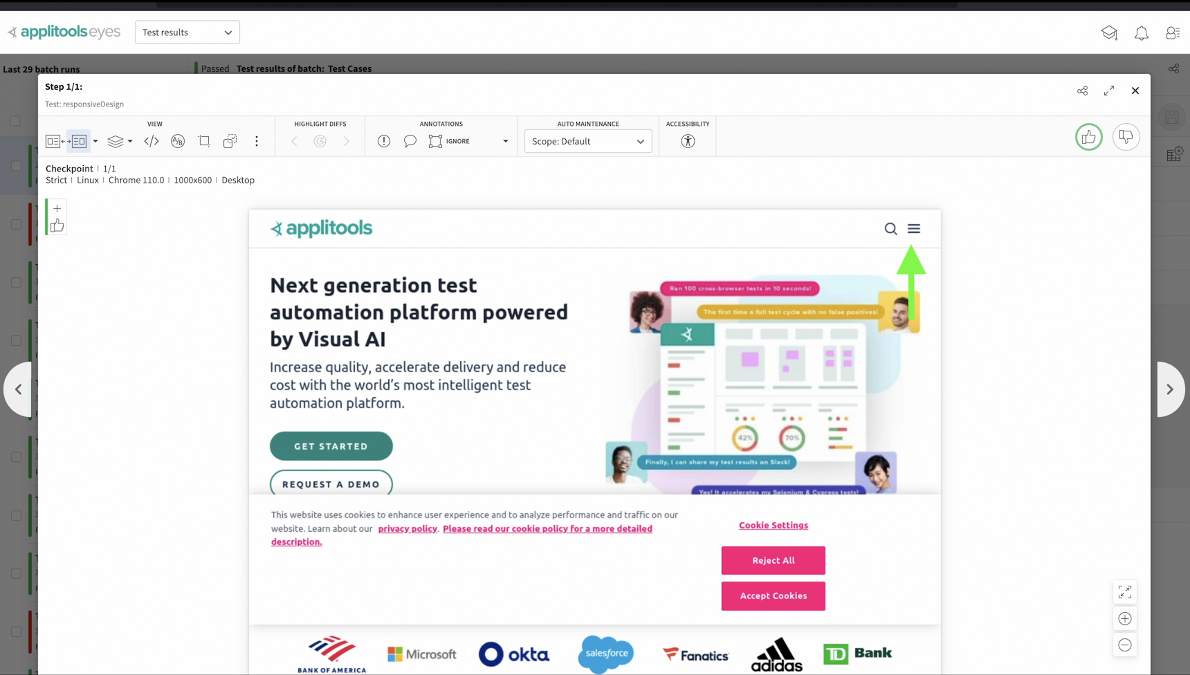
Looking at our test result, we can clearly see that it does not look correct. For some reason, we're still getting the hamburger icon navbar and not the full navbar. This is because the responsive design on the Applitools home page is triggered by JavaScript and this JavaScript was not sent to the Ultrafast Grid in the DOM snapshot as we discussed earlier. Let's now head back to our code and make a quick change in order to resolve this issue.
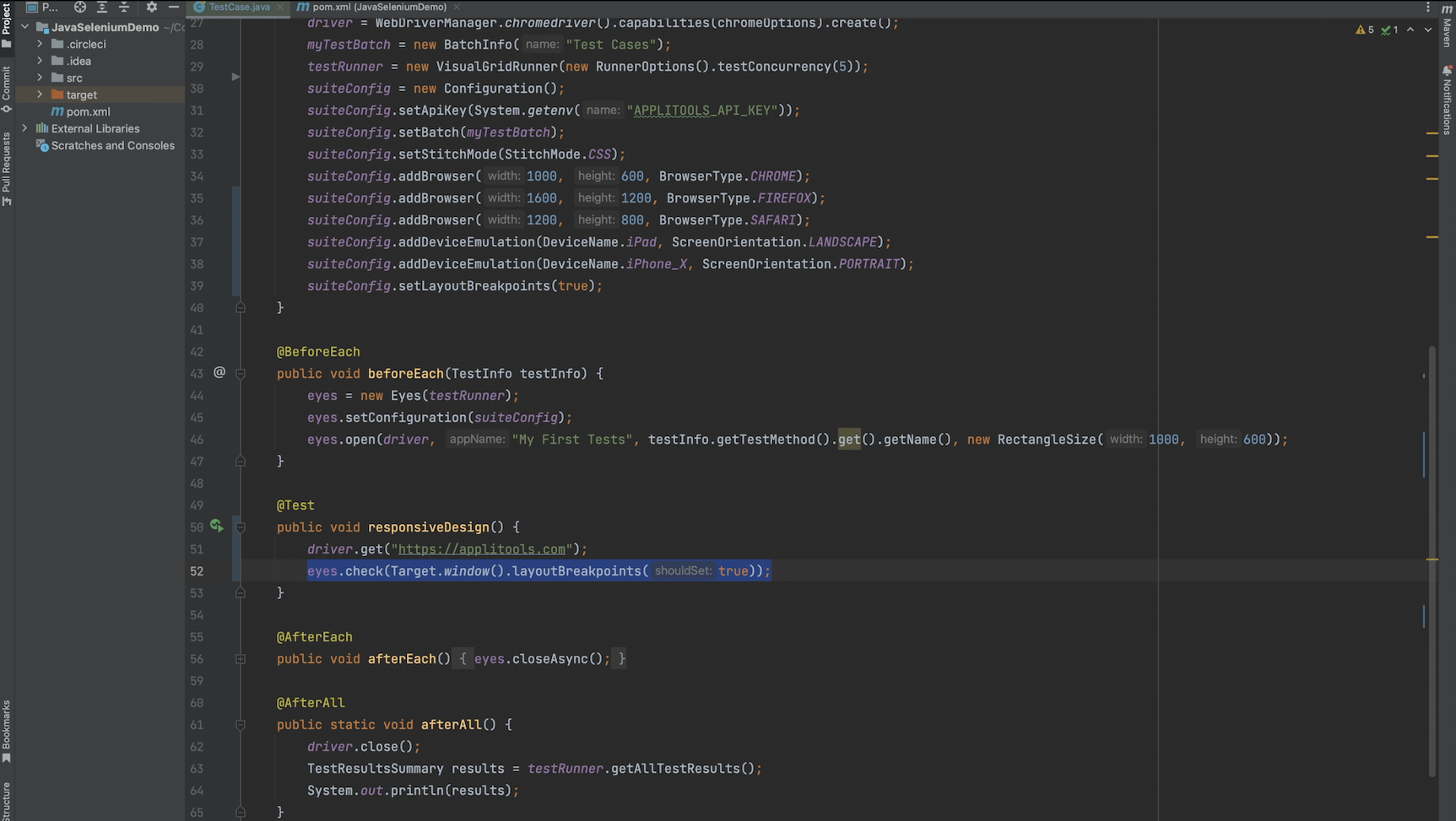
To resolve this issue and capture a clean screenshot for all of the environments we want to render on, I've added a call to .layoutBreakpoints(true) within our call to eyes.check(). Passing true to this function will tell the Eyes SDK to capture a DOM Snapshot for all of the widths that we want to render on so in this case we'd capture a DOM Snapshot for 1000, 1200, 1600 and whatever the widths are for our mobile devices. Instead of passing true, you can also pass a list of numbers specifying the exact widths you'd like to capture DOM Snapshots for. If you're interested in seeing how this works, I've placed documentation on this in the write-up down below.
Before we move on I want to point out that you can also set the layoutBreakpoints option globally on your configuration object. This is only recommended if you know for a fact that you'll need to use this feature for every page that you're validating in your test suite. Otherwise, it is highly recommended to use this feature at the check level so that you're not capturing unnecessary DOM Snapshots as this could increase the runtime of your tests.
After making either of these changes, let's re-run our test and analyze the results.

As a side note, if you run your test in headful mode you can watch layoutBreakpoints in action. As you can see, the Applitools SDK is resizing the local driver to all of the different widths in our browser configuration object so that a DOM Snapshot can be captured for all those widths.

Let's once again review our test with width 1000 to confirm that nothing has changed. As we can see, this one still looks good.

Now, let's check out our test result with a width of 1600. After using the layoutBreakpoints feature we now see the expected navbar for this test result as well.
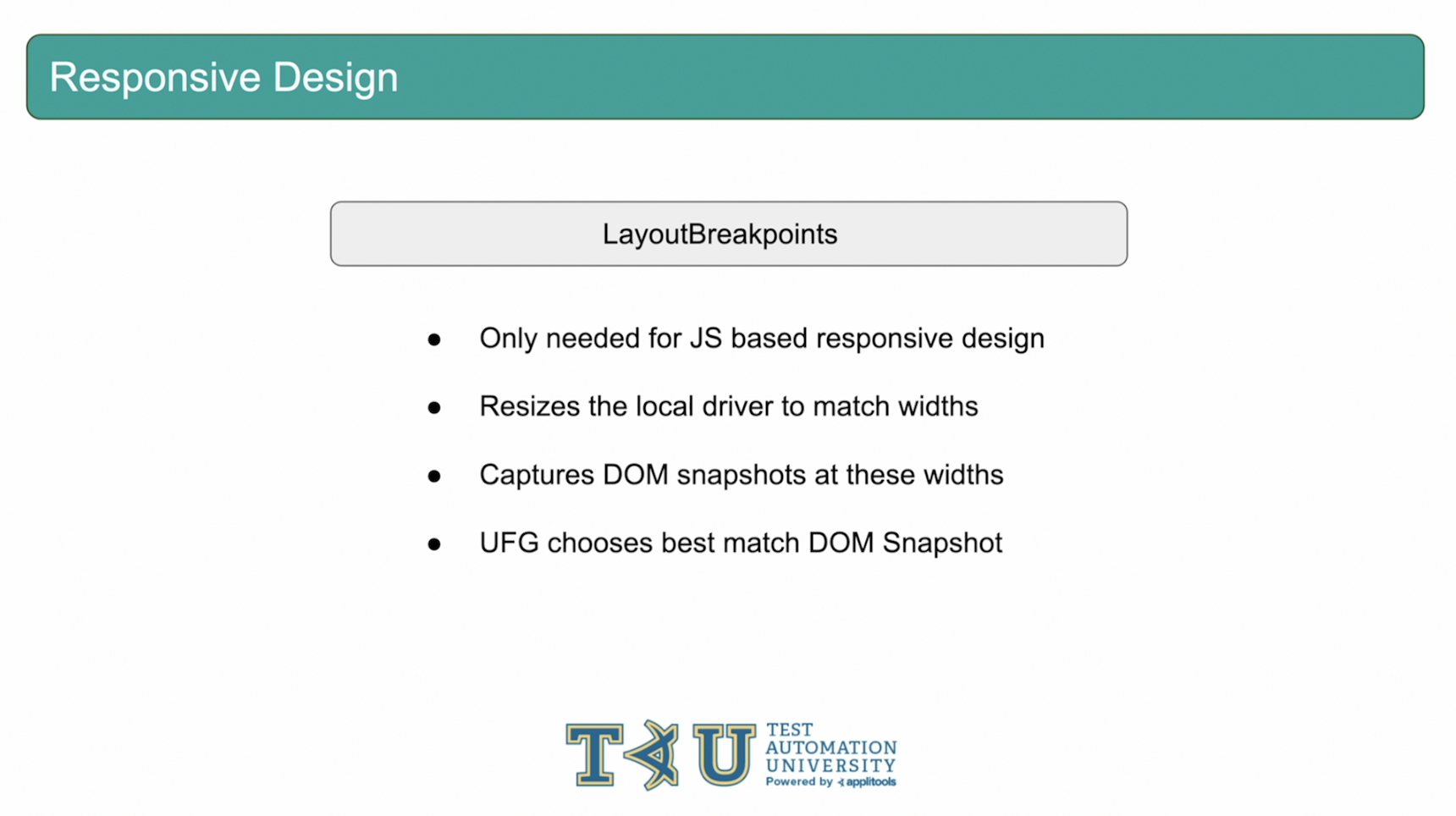
The Layout Breakpoints feature is only needed when your page implements a responsive design using JavaScript. This feature will instruct the Eyes SDK to capture the DOM Snapshot of the page for each environment specified in your UFG browser config. Then, the UFG will select the DomSnapshot that most closely matches the width of the browser it's currently rendering on. This is one of many powerful tools that the Applitools SDKs offer. Let's go ahead and move on to our next interesting case: Lazy Loading.