Transcripted Summary
Now, visual testing is probably a new concept for the majority of us.
I know that when I first started out, I have never really done automated visual validation simply because the old ways of doing it — doing something like a pixel comparison — was not robust enough. And so, it was very flaky, you needed a tolerance and it didn't provide any good results.
But now with the addition of Applitools, visual validation is something that is critical and is extremely important. Once you start utilizing it, you start finding out how many visual bugs there can actually be in different kinds of web applications.
# Examples of Real-World Visual Bugs
So, I wanted to show you some examples of real visual bugs that have happened to real web applications.
Check out this bug from UPS website on a mobile device.
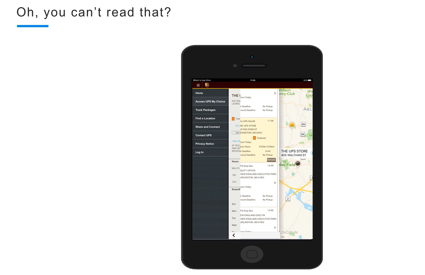
You can see how you actually can't read anything that's going on here. So, these two areas have kind of coalesced together and now this is unreadable.
That is a visual bug and it's very easy to catch this bug using Applitools.
Here is another visual bug from an online newspaper.
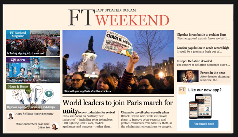
You can see that their text actually wraps into the next and covers up the very first line of this text right here.
It's really funny because as I'm working through teaching this tutorial, I'm actually discovering a ton of visual bugs on my own website, which is great because I can show those examples, but it kind of sucks because I realized that I need to do a lot more work to make my website more visually and user friendly.
Take a look at this.

See how in this specific resolution, which is not a bad resolution, but it's smaller than I'm used to. I'm used to looking at in 1080p.
The website actually starts to put all of the menu options on top of my logo and so you can't even read it.
This icon here as well, I don't think that's a good place for it because there's a search icon and it's kind of in the middle a random place. If anything, maybe it should be like somewhere over here, but again, a real visual bug that I'm actually having problems with.
# So why do visual bugs actually happen?
It's just simply a matter of the test traceability matrix.
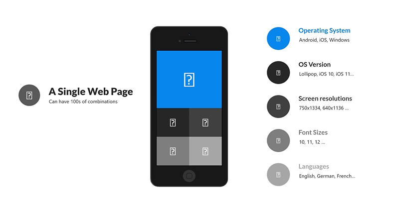
A single web page can have hundreds of different combinations.
You can have multiple different operating systems, — Android, iOS, windows.
You can have different kinds of operating system versions, right? Lollipop, iOS 10, 11 and so on.
And so now you have to start testing and your web application on all of these different devices, in all of the different operating system versions.
You also have to take into consideration the different screen resolutions. What I showed you with my website was actually just a different screen resolution for the same exact website. Even though it's always on the same exact browser, the same exact operating system, the different screen resolution caused a bug on Ultimate QA.
You also have to take into consideration all of the different font sizes and how they will be reflected on different combinations of environments.
There are even different languages such as English, German, French, that you have to take into consideration and how all of that we'll look for just a single webpage.
So, my Ultimate QA home page, as you're going to see in the future, we're going to test it on multiple different resolutions.
And on each resolution, it looks different because my website is responsive. And so, we have to analyze whether on each of those resolutions the website is actually looking good and if it has any bugs. It just becomes simply too much to test all of this. Even in the automated functional testing perspective, it is way too hard and way too much.
So that's why visual bugs happen, is because we don't have the coverage for all of these different devices and matrices.
# That is why you actually must automate visual checks.
Think about how you would actually automate all of the functional checks using any tool — Selenium WebDriver, or Coded UI, whatever tool you're using — how would you actually check that all of the elements and the entire webpage looks as it should?
For example, this element over here, you can see that it's not very readable. So first of all, it's a bug that I need to fix on my end because I didn't test the application in this resolution. I'm always looking at on a giant 1080p screen and to me the webpage looks absolutely fine. However, in this other resolution you can see that you can't even read that the logo at the bottom and it looks kind of pixelated. So that isn't good.
So how do we actually test it using Selenium?
You have to get the logo; you have to check its resolution. But even if you get it to resolution, I guess at some point you have to figure out: what is the expected resolution, and what is the expected size of the logo?
Then once you know that you can compare it.
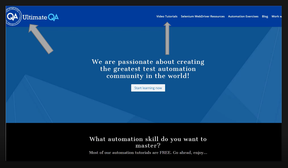
But then also, how about this, for example, is this the right text? Is it the right text size? Is it the right text color?
There are so many things to check about each of these elements. Even this button, is it the right color? Does it have the right text? Is it in the right location?
This is the same exact page over here in a smaller resolution.

Take a look at all of the problems that you can see. Look at the logo in the upper left-hand corner, for example. It is now smaller and totally unreadable. Absolutely needs to be fixed.
How about that white space in the center over here? Can you see that? That is definitely a bug and I had no idea that it even existed until I opened up this page in a smaller resolution.
So now the question is how would you think about it? How would you even automate this?
If you can figure out a way to test for this gap between the two different sections, then does that mean that you need to automate this for testing every single gap between every single section? So, okay, that's pretty complicated, so many lines of code.
There's also stuff like this where you have to validate that this is the right icon that appears here, and is it the right color?
And how about this gap for example? Did you know the gaps are extremely visually important? I had no idea until I had been talking to my user experience buddies and the gaps like this are very important.
In fact, what's even important is spacing between the letters. Because imagine if the letters are too closely spaced. Now, things like this, the P will start overlapping with the H and so things will become unreadable.
In fact, something with the appropriate space is much easier to read than something with the incorrect space. So, I actually worked with my UX buddies to design something like this to make it look better and easier to read.
But how do you actually automate and test all of that using functional testing and Selenium WebDriver? Can you imagine how many thousands of lines of code it will take to check every single element for every single CSS property? It would be insane.
So that's why Applitools comes in and helps by making it extremely easy with a single method that can check an entire webpage.
