

Transcripted Summary
Let’s now take a look at viewports.
A viewport is the visible area of a webpage on a display device.
For example, let’s say we wanted to make sure our website looks perfect on all devices and screen sizes. If we know the dimensions of the device we are testing on, we can easily tell Applitools to mimic a test that represents the screen size of that device.
Now an effective way of identifying viewports for your tests can be done right from your browser using the developer tools.
You can access this menu one of two ways:
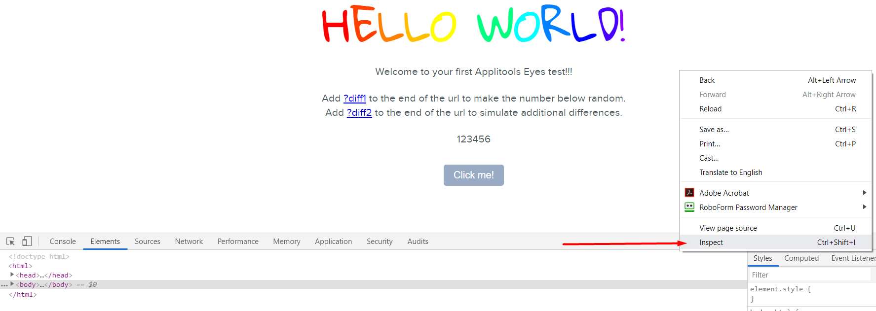
Option 1 - Right click and inspect the page
Option 2 – Go to: Menu [Customize and control Google Chrome
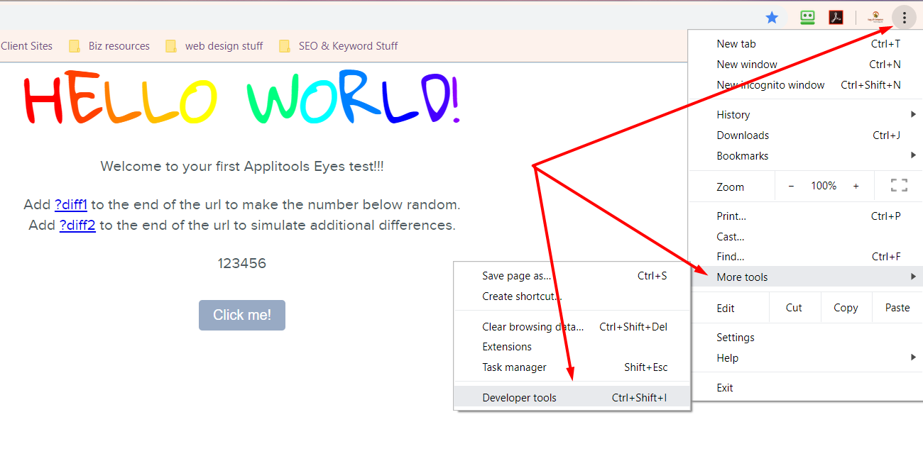
Accessing Developer Tools
The instructions above are for accessing Chrome Developer Tools. If you are working in a different browser, for example Mozilla Firefox, there is similar functionality, but you will have to follow the specific steps for the browser.
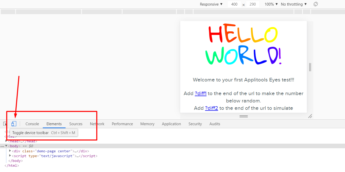
Once you’ve brought up the Developer Tools, you're going to want to toggle the device toolbar by click on this icon.
Now if we click the Responsive dropdown [at the top] you will be presented with a list of various devices with their height and width.
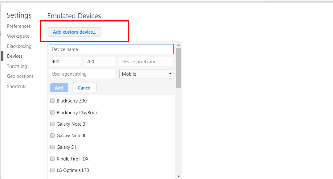
If you want to see more devices you can select the Edit option.
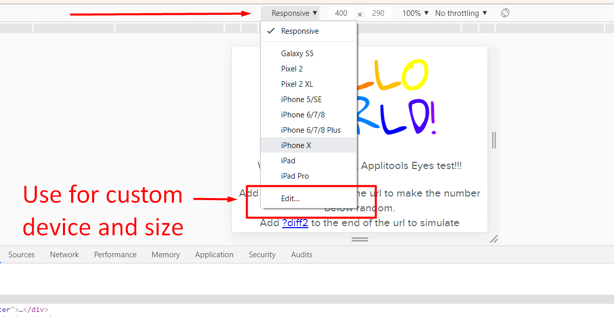
You can also add your own custom device with your own predefined width, height and device type [from the Edit tab].
Now let’s use the iPhone X dimensions for our example — as you can see it has a width of 375 and height 812
Before we were setting the viewport size based on the browser.getViewPortSize() function.
We will now be setting the height and width manually.
// Start the test and set the browser's viewport size to
await eyes.open(browser, 'Viewport Example', 'Mobile', { width: 375, height:  812});
Let’s now run our test to see if this custom viewport applied.
# viewPort.js
// Initialize the eyes SDK
const { Eyes, Target } = require('@applitools/eyes.webdriverio')
const eyes = new Eyes()

// set your private API key.
eyes.setApiKey(process.env.APPLITOOLS_API_KEY)

describe('Viewport', function () {

    it('Page should look ok', async function () {
        // Navigate the browser to the "hello world!" web-site.
        browser.url('https://applitools.com/helloworld')

        try {
            // Start the test and set the browser's viewport size to
            await eyes.open(browser, 'Viewport Example', 'Mobile', { width: 375, height:  812});

            // Visual checkpoint #1.
            await eyes.check('Main Page', Target.window());

            // End the test.
            await eyes.close();

        } finally {
            // If the test was aborted before eyes.close was called ends the test as aborted.
            await eyes.abortIfNotClosed();
        }
    })
})
In the Test Manager we can then see that custom size that we set has been applied. If we open the tests you can see that the snapshot resembles that of a mobile device.
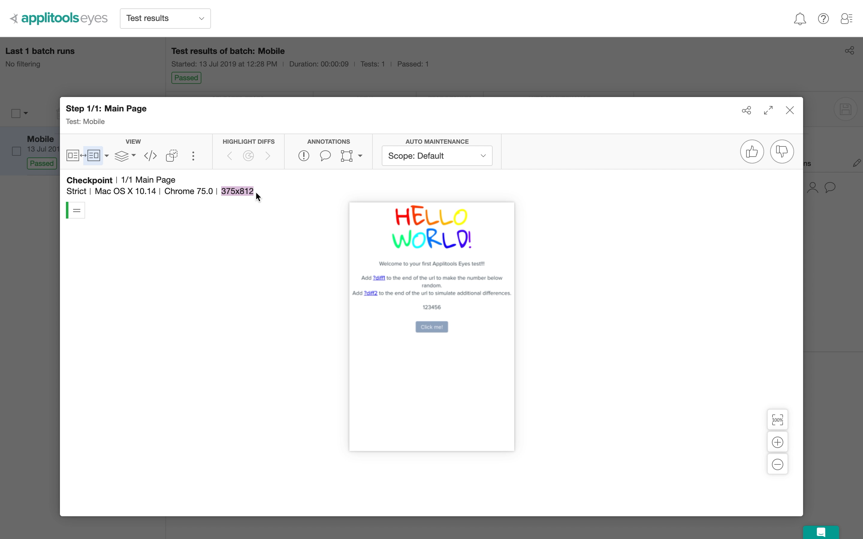
From this we can see that customizing viewport is an effective way to test sizes in scenarios where we want to ensure our website looks perfect on every device.
Ok, so for the next chapter will be looking at different Match Levels that Applitools provides.
Resources
Quiz
The quiz for this chapter can be found in Section 4.2