Transcripted Summary
Hi everyone, and welcome to Test Automation for Accessibility. I'm Marie, your instructor for today, and in the first chapter, I'll give you an introduction to web accessibility.
I'll start off with an interesting fact about accessibility that you might not know.
Accessibility is often abbreviated to A11y, or Ally.
The 11 in the middle represents the number of characters between the letters A and Y.
However, when you see this abbreviation, you would still pronounce it as accessibility.
# So what is accessibility?
Accessibility is the practice of making a product that is usable by everyone, with or without disabilities.
It's often confused with usability, and the main difference is that accessibility is focused more on people with disabilities, whereas usability focuses on all aspects.
A product that's designed, developed, and tested with accessibility in mind will have more users than a product that is not accessible.
In the UK alone, there are 13.9 million people with some form of disability. This means that one in five people in the UK have a long-term illness, impairment, or disability.
Some have temporary disability, and by keeping accessibility in mind, we help these people to be included and use our products without any issues.
In light of these statistics, many establishments and companies still don't design with accessibility in mind.
Just to raise awareness - and this is not related with web accessibility - but I saw this tweet before where the student, Sarah, who studies at the University of Hull can't attend her lecture properly because the lecture room was not designed to be accessible.
She couldn't even take notes because she doesn't have a table.
I can't imagine her frustration and this is unacceptable.
The link to Sarah's twitter post can be found in the resources section down below if you want to have a look.
Nowadays, where mostly everything can be accessed online, and we rely on the internet every single day to perform most of our tasks, this puts more pressure on businesses to make their applications accessible.
Business organizations have a responsibility to all their users that the features they provide can be accessed by everyone.
As more and more devices become available and we have different means to consume information, websites and mobile apps should be designed with accessibility in mind.
Especially during these times of pandemic, web accessibility is so important because now everyone uses the internet to do things that they couldn't do physically, such as buying food or groceries.
You probably heard about the Domino's Accessibility case where a blind man sued Domino's because he couldn't order your pizza from their website and mobile app, even with using a screen reader.
However, when I was reading about that, the law and regulation around web accessibility is still a blurred area.
If you have a website that's low in accessibility, this doesn't automatically mean that you will be sued.
However, accessibility issues can cost loss of users, which in turn, loss of money to the business, which is why it's a serious issue that needs to be addressed.
# Web Content Accessibility Guidelines 2.0
The W3C or World Wide Web Consortium has come up with the Web Content Accessibility Guidelines, which provides a list of guidelines and recommendations on how to make your website more accessible.
Version 2.0, which was published on December 2008, contains a set of rules which were grouped under four categories - perceivable, operable, understandable, and robust.
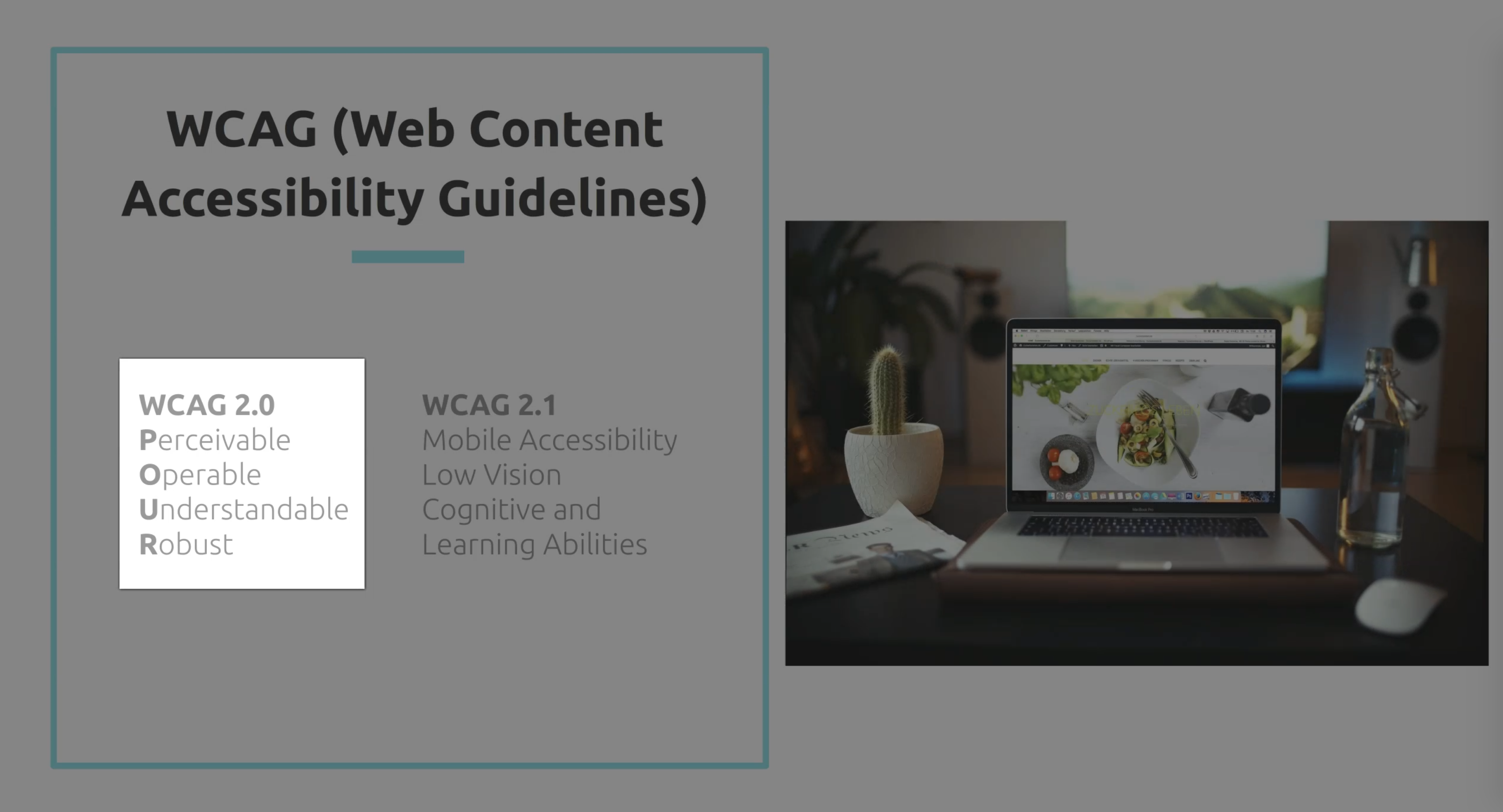
Or if you want an acronym, it's POUR for short.
Then in June 2018, version 2.1 was published to cover mobile accessibility, people with low vision and cognitive and learning abilities.
It's an extension to version 2.0, so other things guidelines from 2.0 will also apply in 2.1.
Let's look at these in a bit more detail.
Perceivable means that the information should be presented to your users in different means.
Some of your users might have some difficulties with one of their senses, which means that they have to be reliant on using an assistive technology, such as screen readers to access your website.
Operable refers to the principle that your users must be able to operate your website by using different means.
For example, some of your users might have motor difficulties and will find it hard to use a mouse.
This means that your website should also be accessible if users will only use a keyboard.
The third principle is about making sure that your users can understand the information presented to them when using your website.
This means that clear instruction should be presented and there should be error messages to let them know and understand when they make mistakes.
Robust refers to making sure that your website must be used by your users when they use third-party assistive technologies, even if the technology advances.
And this is done by adhering to standards, such as correct HTML structure, for example.
# Web Content Accessibility Guidelines 2.1
Version 2.1 was introduced due to the rise of mobile devices and tablets, and to also cover a wider array of disabilities, such as people with low vision or cognitive and learning disabilities.
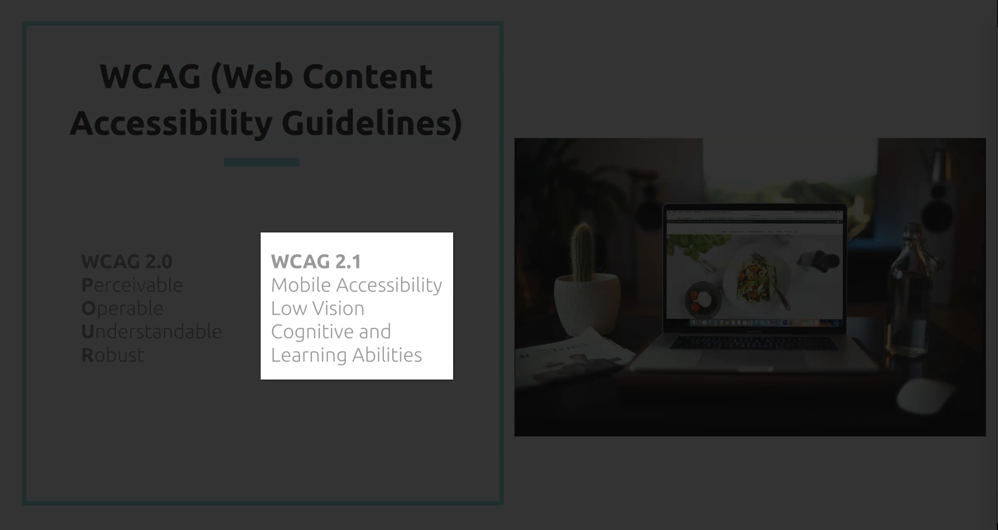
With this version, you need to make sure that your website is accessible in both portrait or landscape mode.
If you have animations on your website, you need to make sure that you have the option to turn it off.
Also the ability to zoom text easily, so people with low vision can read it without issues.
To know more about the four principles and the new rules that have been added in version 2.1, check out the link that I provided below in the resources section with regards to Web Content Accessibility Guidelines 2.1.
# WCAG 2.1 Conformance Levels
Within the Web Content Accessibility Guidelines, each of the guidelines under 2.0 and 2.1 have a success criteria.
This is defined through the three conformance levels that businesses or companies should conform to.
Level A is the most basic conformance and through each level A, you must achieve 25 criteria from the accessibility guidelines.
Level AA is mid range and through each level AA, apart from achieving 25 criteria from level A, you also need to achieve 13 new criteria on this level.
Finally, you've got level AAA, which is the highest conformance level, meaning that you need to achieve the previous two levels, as well as another 23 criteria on top.
To distinguish level A and AA, let's take the example of using captions or subtitles.
In order for you to reach level A rating, you should be able to provide captions on a prerecorded video as a minimum.
On the other hand, to reach level AA, you should be able to provide captions on a real or live video.
Another example is using only a keyboard to access a website.
Through each level A, all users should be able to navigate through your website with just a keyboard.
On the other hand, the ability to zoom into the text content is level AA.
As a starting point, it's a great start to make your website conform to level A, and then work your way through level AA to include more users.
It's not mandatory to achieve level AAA as this is more targeted to specialist websites.
The recommended level is level AA, and this is the level that most teams are aiming to meet.
To find out more about the conformance levels, I highly recommend reading the links that I added below as a resource.
Just to summarize the accessibility guidelines, I created this diagram here, which shows how everything links together.
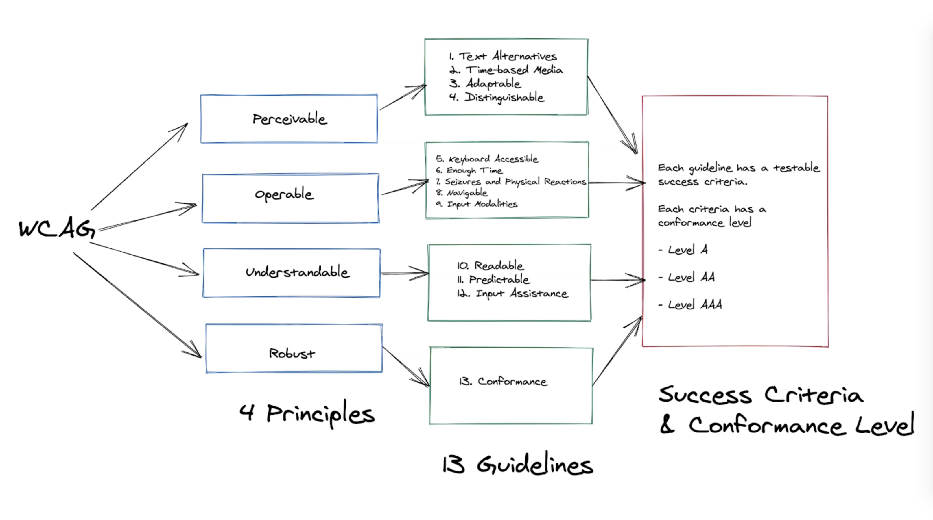
First, we have these four principles that make up the accessibility guidelines in general.
Each of these four principles contains a set of guidelines to guide you on how to achieve this specific principle.
Then the guidelines contain a set of testable success criteria where each of the criteria has the conformance level.
Let's take one example to make it clearer.
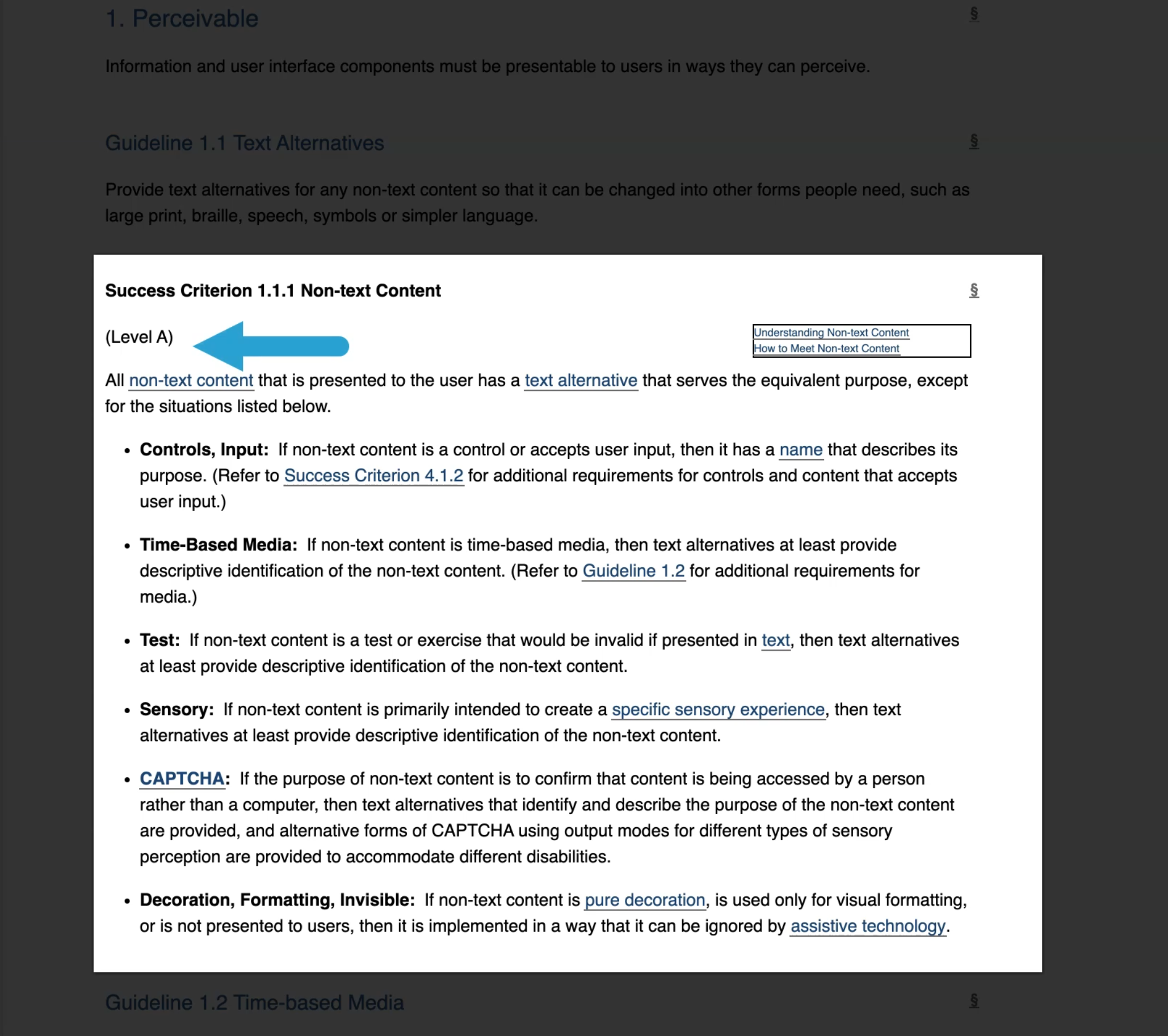
One of the guidelines under the perceivable principle is about texts alternatives.
This guideline talks about making sure that non-text content such as images have text alternatives.
In order to meet this guideline there is one success criteria, which also shows the conformance level rating that you will achieve if your application meets this criteria.
Now that you have an overview as to what accessibility is, in the next video, I'll talk about accessibility testing and why it's important to do it. And then look at how we can integrate this in our testing strategy to help our team develop accessible websites or applications.
