Transcripted Summary
For this subchapter, we'll look at how you can analyze the different accessibility violations that you get from Cypress-Axe.
If you remember from the previous chapter, we ran our first accessibility tests on the React To Do application.
We then got notified that there were four accessibility violations detected.
As testers, we need to understand what these different violations mean so we can explain it to our team clearly.
The good thing about Cypress Axe is that they provide more information on these different violations, and we can do this by opening our Developer Tools Console, which I will demo shortly.
I'm back on my Cypress Test Runner, and I'm going to show you how you can analyze the different errors.
With Cypress, you have access to developer tools, and you can do that by right clicking on any part of the Test Runner and click "Inspect".
This should launch the developer tools, which you can see here.
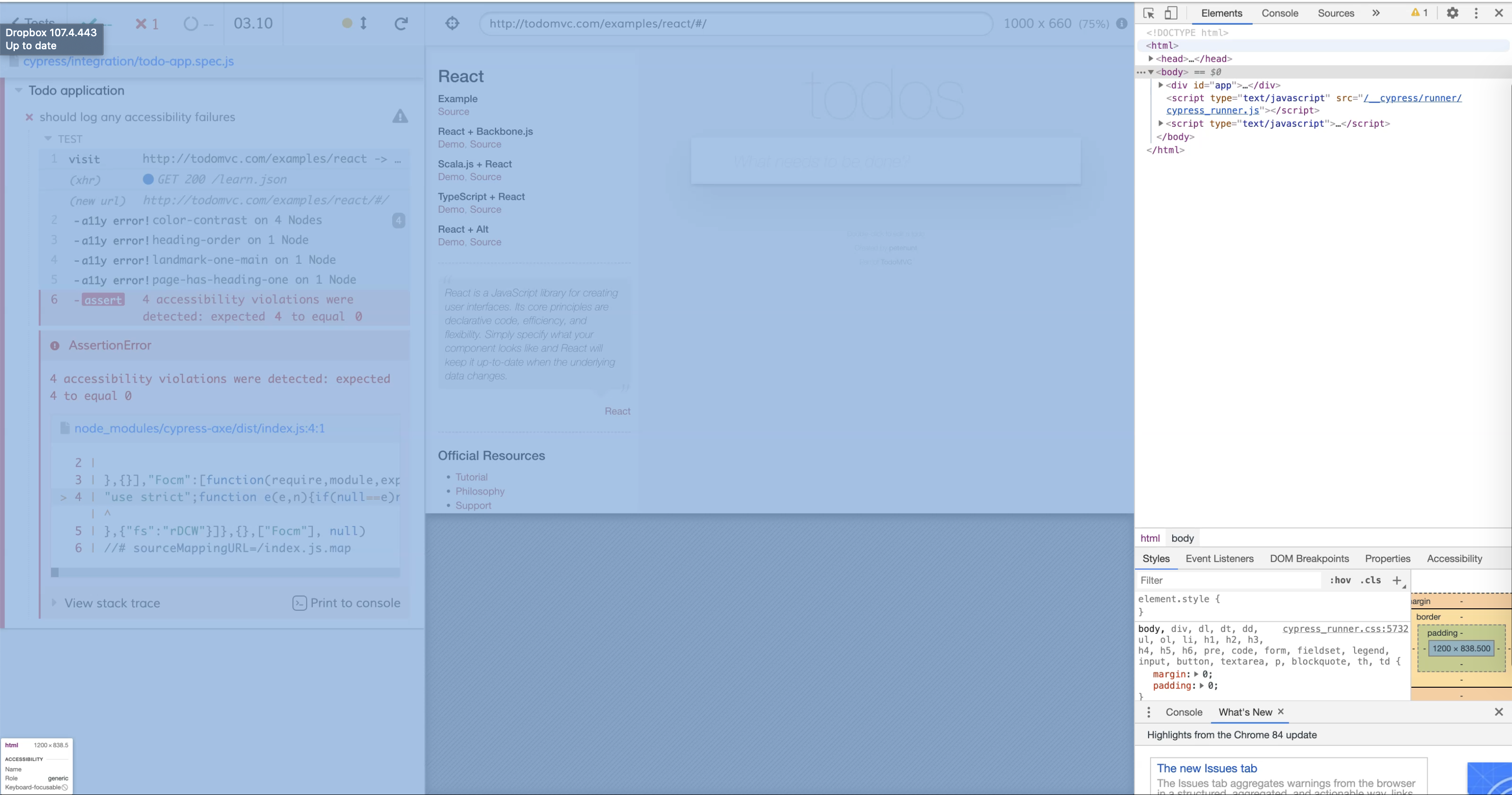
Let's click on the first accessibility violation, which is related to color-contrast.
As you might notice, after clicking the violation, additional logs in the console are printed out.
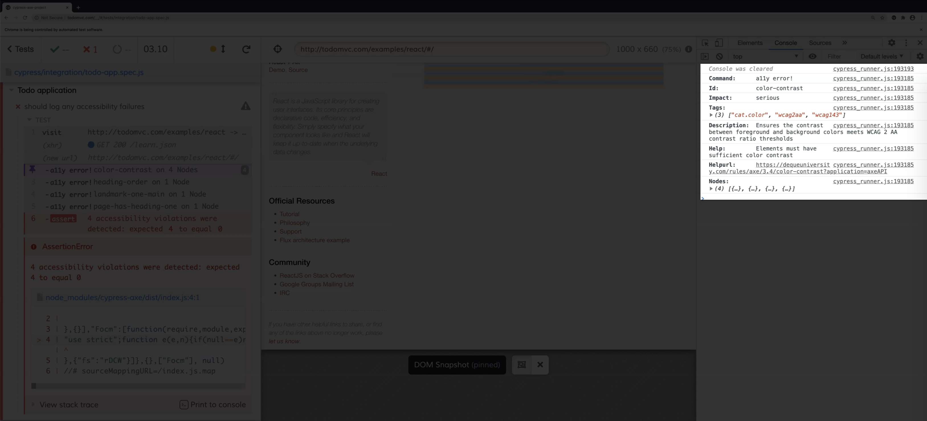
You get a description as to what the accessibility rule is.
In this case, it's about ensuring that there is sufficient contrast between the foreground and background colors.
Axe also provides a help URL, which you can directly click on, and this should redirect you to their help page, which contains relevant information, such as how to fix the issue.
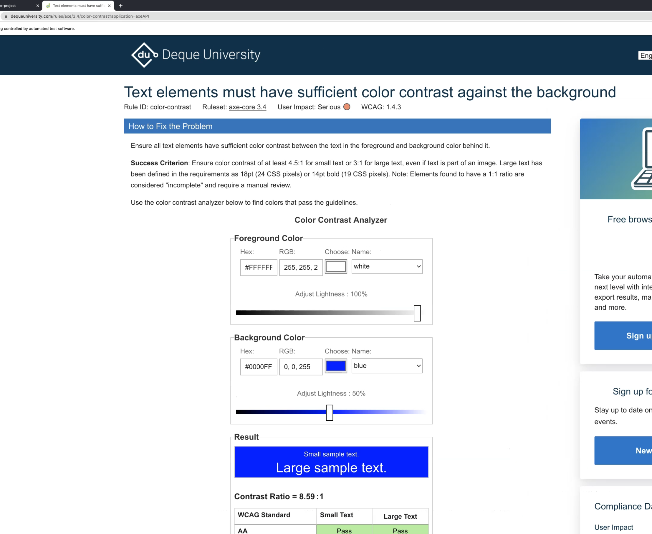
You can see here what the success criterion is, and they even have a color contrast analyzer that you can use to help you decide if your colors are accessible.
You can also find other information, such as why this rule matters for people with low vision.
Let's go back to our test and see what else might be helpful.
As you can see, there is an array of nodes here.
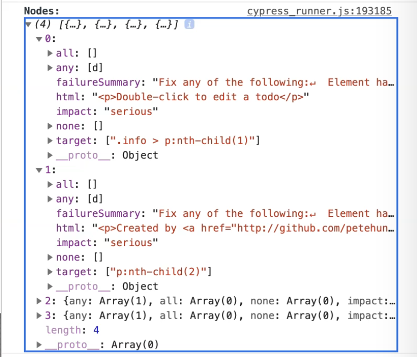
This array contains the specific elements which violated the color contrast rule.
If you expand it one by one, you can find out which specific selector needs to be changed.
If we look at the next accessibility violation rule, it's about the heading order.
Order of the headings matter and must be organized, because assistive technologies use this to provide the navigation.
The next accessibility rule is about having one main landmark in your page.
Having a main landmark ensures that people with disabilities can access the primary content of your page easily.
The last accessibility rule violation is about making sure that your page has heading one.
Generally, it's best practice for your page to have a heading one, since this will allow users to jump directly to the main content of your page.
From here, you can also see the impact of each of the accessibility rules.
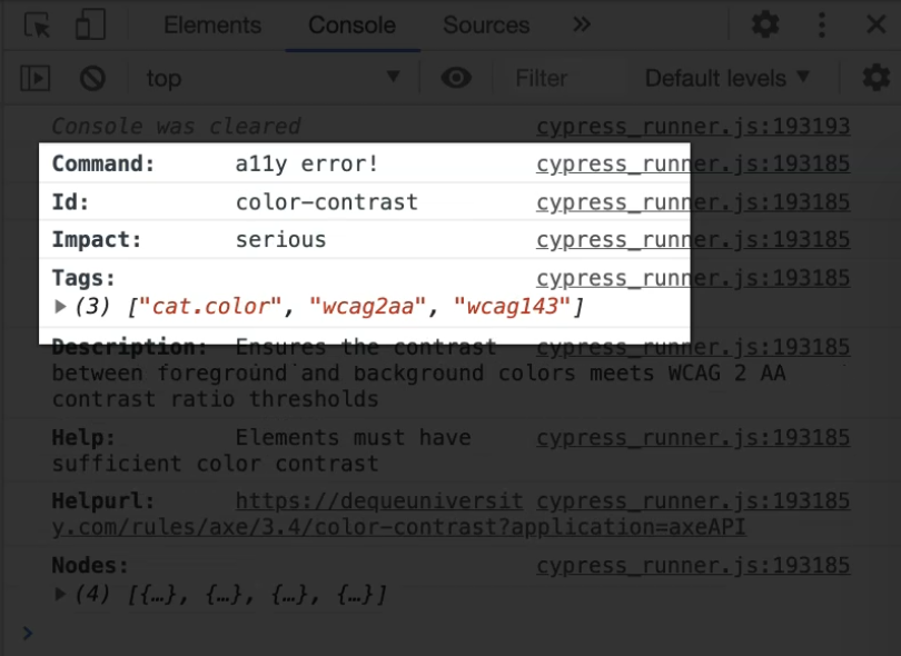
You can see that the color contrast has a more serious impact as opposed to the other three violations.
This should help you advise the team which rule you need to address first and prioritize.
And that is it for this video.
On the next video, we'll look at how you can test a specific element rather than the full page with Cypress Axe.
Quiz
The quiz for this chapter is in section 7.4
