Transcripted Summary
We are now in the final chapter and if you're still with me, I just want to say, well done. You're almost in the finish line.
In the previous chapter, we looked at how we can use Cypress-Axe in a test project.
In this final chapter, I'll talk about another tool that you can use for checking accessibility violations, and that is the Applitools Contrast Advisor.
You probably heard of Applitools already and the first thing that might come into your mind is cross-browser visual validation testing.
But did you know that Applitools also released support for accessibility testing via the Contrast Advisor?
With Contrast Advisor, you can validate contrast issues with text and non-text elements such as graphics and images.
I've added the link to their documentation site for your reference, in case you want to read more about Contrast Advisor, which you can find below under the Resources section.
You're probably wondering - why do we need another tool?
Applitools noticed that there is a gap in the market.
Currently, there are tools to test the color contrast of text elements, but there are no viable solutions to test for contrast in images and native mobile applications.
The web content accessibility guidelines have different rules for minimum and enhanced contrast ratios and this includes graphics and user interface components.
However, existing tools cannot detect these violations.
Just to give you a bit more overview as to what accessibility guidelines Applitools Contrast Advisor verifies - similar with existing tools, such as Axe, which you saw on previous chapters - Applitools can also test against the contrast minimum success criteria.
Under this criteria, to achieve level AA, the contrast between the foreground and background colors for normal text should be 4.5:1 and 3:1 for large text.
Applitools can also test against the contrast enhanced success criteria, which is applicable if you want to reach level AAA.
Under this criteria, the contrast between the foreground and background colors for normal text should be 7:1 and 4.5:1 for large text.
Finally, as I mentioned in the previous slide, Applitools can also test against non-text contrast success criteria.
Under this criteria, to achieve level AA, the contrast between the foreground and background colors for non-text elements should be 3:1.
So how does it work?
You'll see in the demo, later, of course.
Here's a quick look at how Applitools can detect accessibility issues.
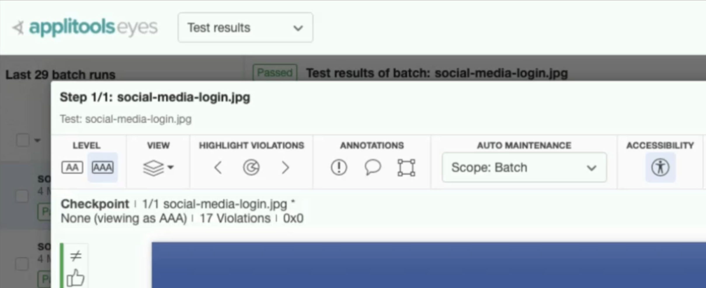
On the Applitools dashboard, you can toggle the accessibility feature and once that's enabled, Applitools will highlight all the elements that have low contrast.
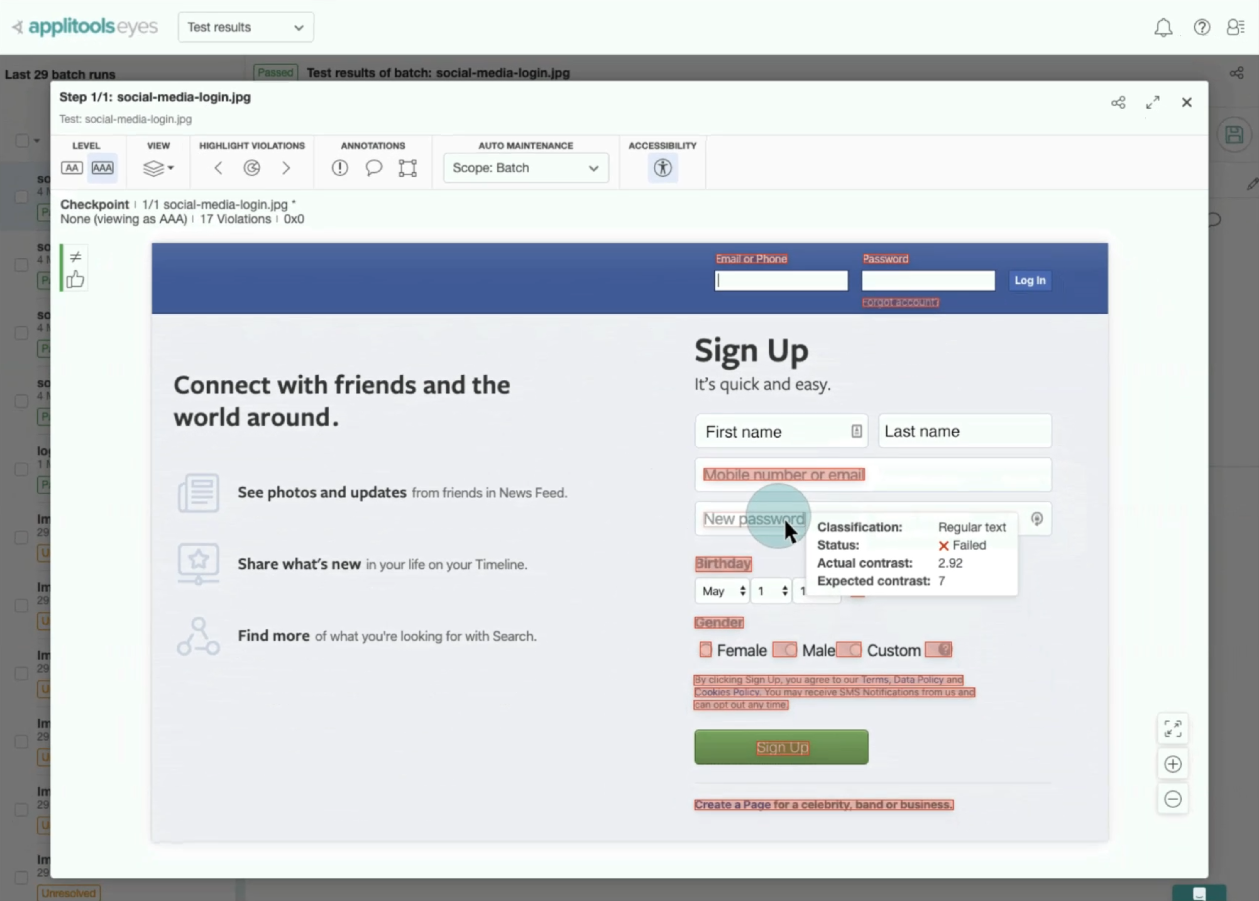
You can toggle between level AA and level AAA conformance levels.
The great thing about this is that if your company is already using Applitools, there is no additional test to be written if you want to use Contrast Advisor.
Just enable the accessibility feature and that's it. You'll see a list of contrast issues immediately.
In the next subchapter, I'll give you a quick demo on how we can integrate Applitools to our Cypress project, so we can extend the test that we have written on the previous chapter.
Resources
Quiz
The quiz for this chapter is in section 8.3