Transcripted Summary
# Recap
We have been on quite the journey so far.
All of the steps up until this point have led us to an opportunity to explore a new data structure called "events" that promises to open up new opportunities for the visibility we have into our systems.
Before we jump into using events, let's do a quick recap of where we have been.
We started by taking an interesting well-suited Selenium test suite and made it even more extensible by building and testing it through the consistency of a Maven build.
With this new runner, we had the chance to introduce a GitHub Actions pipeline, which would run the tests on every build.
This opened up the possibility of tracking trend data over time, so we introduced some bash scripts to extract and prepare that data for querying.
But in order to collect, store and visualize that data, we needed some help.
The first thing that we did was we stood up a free and open source tool called Prometheus on our own laptops.
From there, we decided to try a different style of data store.
So, we also signed up for the free tier on a tool called Honeycomb, which does most of its work using the event data structure.
But honestly, all of this has been fun, but only useful because we are targeting getting insights from the data we're generating.
What drove us past that original local build was the desire to understand how this looked for everyone on our team.
Once we saw that data in GitHub, it was clear that having to explore each and every run individually was not sustainable.
So, we introduced our first data extraction and from there, we wanted to get the data into a graph.
With that graph, we realized that the data quality was only as good as the context it carried with it.
So, we explored adding higher quality context in, which introduced us to the concept of cardinality.
This led us to a more natural data store for that high cardinality data, which is events.
Throughout each of these stages, we've had some learnings and some things that we would absolutely benefit from adding to our environment at work.
But so far, we still have only supported identification and monitoring of changes.
We still need to find ways to make investigation and fixing more supportive.
That's because if we remember back to an early definition of observability, it's not just about knowing that the problem is happening, but also knowing why it's happening and where you can go to help try and fix it.
With the next stage, what we want to do is see if the investigation and fixing side of the lifecycle can be addressed alongside the identification and monitoring.
# Event Data Store
Let's go ask some of these questions of our event data store.
First thing we're going to do is have a deep dive into the differences between visualizations in Prometheus and in Honeycomb to understand the "reality" of pre-aggregation.
In Prometheus, we collect data as a period of time as stored as a single data point - that's that 15 seconds.
How does that affect data visualizations in comparison to our event store, where we are storing each and every action?
Next, we're going to take that high cardinality data that we have access to in our event store and we're going to see how that helps us with investigating an issue.
Finally, we're going to look at what it takes to smooth out that high cardinality data in our event store and why we might choose to do that.
# How pre-aggregation affects the reality of data visualizations
So, here we are in Honeycomb.
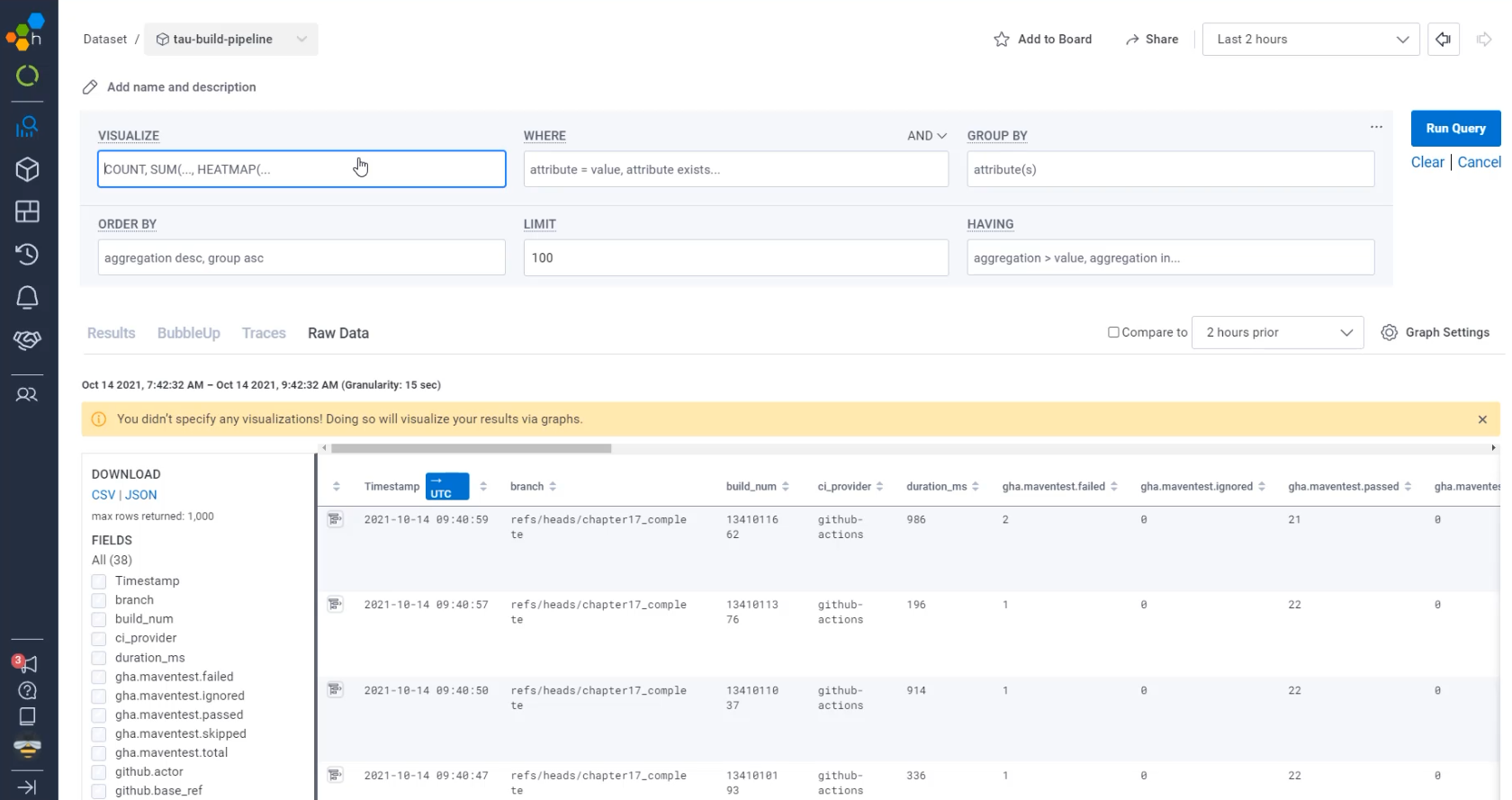
So far, the way we've used the queries is just to run an empty query.
When we do that, we get a table view.
This provides us really detailed information about what we are collecting, but it doesn't give us a very clear visual like Prometheus does.
To do that, you need to add to the "VISUALIZE" part of the query.
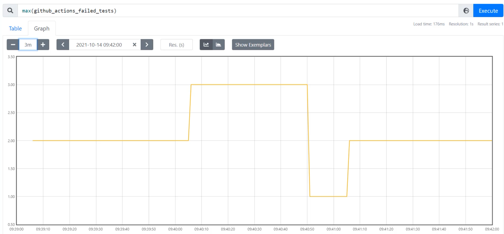
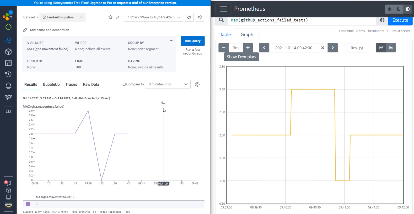
I'm going to start by visualizing the failed tests, just like we were doing in Prometheus. So I'm going to say MAX(gha.maventest.failed) and Ctrl+Enter will submit that query.
I can see here that I've sent a whole bunch of data recently, so I'm going to zoom into that time period.
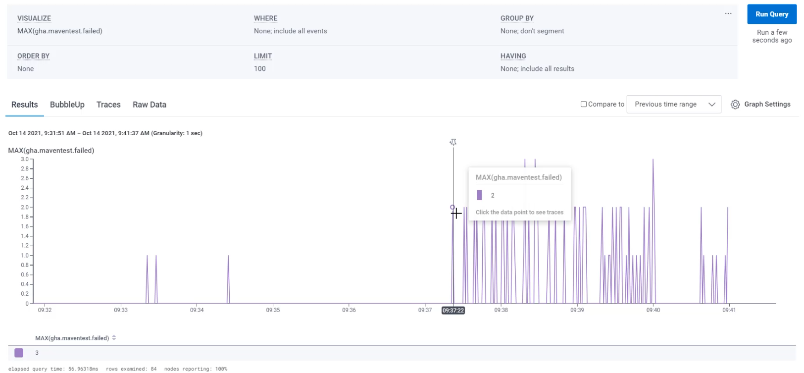
With that, I can see that I have at times only had a single test failing.
At times, I've had two tests failing, and sometimes, I had as many as three tests failing.
Before we continue on, let's compare this to Prometheus.
Here in Prometheus, I'm going to recreate that same query.
I'm going to say, I want github_actions_failed_tests and I'm going to "Execute".
When I go to "Graph" that, I'm going to want to zoom in to the last 10 minutes, which I can do by changing that to 10m.
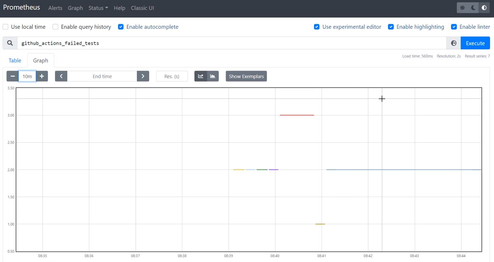
With this, I can see that I also am getting a bunch of readings, some at 2, some at 3, and some at 1… but it looks very different.
I also haven't asked it for maximum yet, so to do that, I'm going to say max().
The reason that I need to ask it for maximum is if it gets more than one reading at the same time, it needs to know how to pick which one to put on the graph.
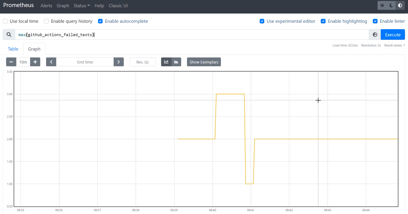
With max(github_actions_failed_tests), I'm able to see that the numbers stay fairly the same - I sometimes have one, two and three.
Let's align the time of these graphs a bit better.
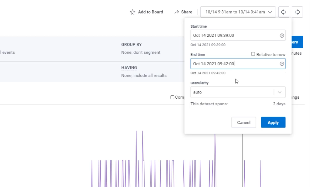
I'm going to set an end time of 09:42:00.
And because the data only starts here at 9:39, I'm only going to look over the last three minutes.
With that, I have a pretty zoomed in graph.
Let's go do the same alignment in Honeycomb, 9:39 to 9:42.
Here I can search and I can do a custom time from 09:39:00 to 09:42:00.
I have now two graphs that are from the same period of time, that was generated by the same script, but are showing us very different things.
Let's do a side-by-side to see that.
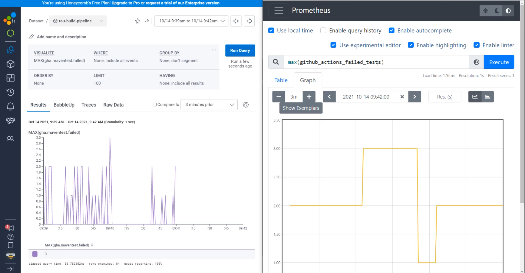
In both of them, we are querying for the maximum of the GitHub failed tests, but in one of them, I see that there's data that is showing the individual queries, including that there were a lot of times where there was one failed test, like at 09:39:25.
In Prometheus, if I go to 09:39, I can see that this was showing two failed tests at that time.
That's because in Prometheus, we get data every 15 seconds, so whatever the data is at the end of that 15 seconds is the data that we store.
Let's now try and make Honeycomb look more similar to Prometheus.
The way I can do that is to use the "Granularity".
Here under "Granularity" right now, I am showing an event for every one second.
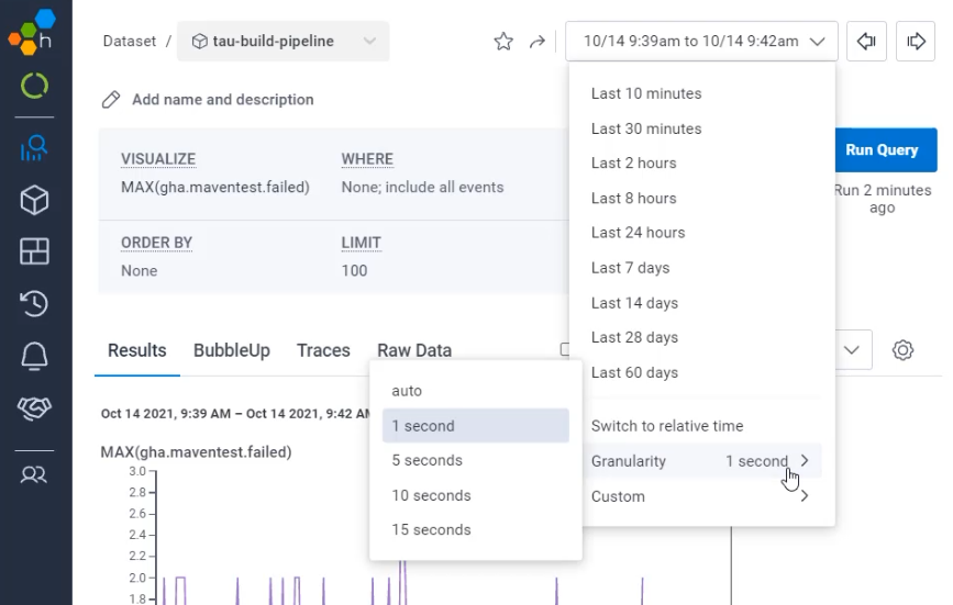
If I switch that to an event every 15 seconds, I now see a very similar view to here in Prometheus.
There are some reasons why you may want this more smoothed out view, but we also want to understand what's going on underneath.
# Using high cardinality data to investigate an issue
Let's dive into the section where we know that there was a maximum of two failed tests.
If I click on this, it's going to bring me to an exemplar trace.
There's many traces over that time period and this is going to be one of those bucketed time traces.
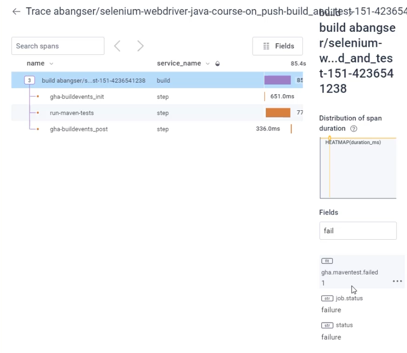
Now, if I look for the field without failed tests, as you can see, it is showing only a single failed test, despite me clicking on a line that showed two.
With this, you can see how having your metrics be based on events allows you to dive into the details rather than being left with only the high level view.
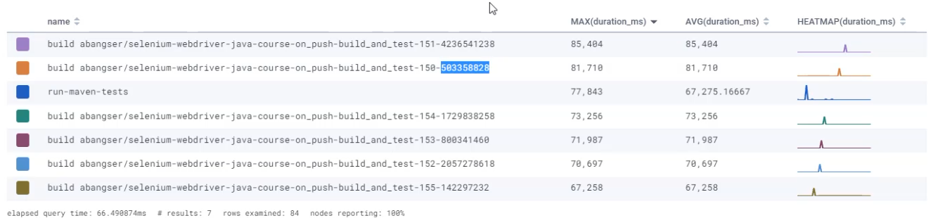
Focusing back on just the events, let's go and find something that we might want to investigate. For example, you might want to investigate something around duration.
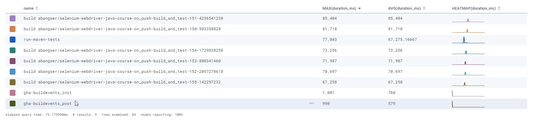
Let's make a couple of graphs that show us how long these tests have taken to run.
I can start with MAX(duration_ms) and also look at AVG(duration_ms).
I'm going to add one more type of graph, which is called HEATMAP(duration).
Let's go explore those.
Now that we're just focusing on this, I'm going to zoom into the period of time where data exists.
That will zoom for all of the graphs, so let's scroll down and check out these graphs.
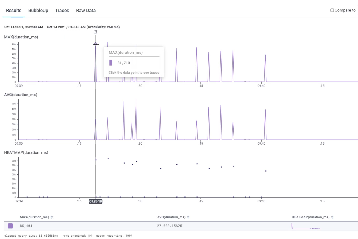
I can see here that my maximum duration is around 81 millisecond, so 74 and so on.
I can see that my average has some big spikes and some little spikes, but the overall average across the entire graph I'm looking at is 27 milliseconds.
I can see that there's a big difference here. Sometimes it's taking 85 seconds, sometimes 27 and in the shape of the heat map, what this is showing is the duration along the X axis and the count of events on the Y.
So a ton of very short requests and then go to the very long end tail and we see some noise down there.
I can see that here on this graph as well.
I can see that there's a lot of requests along the short end, but also some along the top duration.
I want to understand why this might be, so I'm going to go to the tab that's called "BubbleUp".
On the "BubbleUp" tab, I can scroll down and then I can use the heat map graph.
What I can do is I can select a group of events that I'm interested in comparing.
The group I'm going to compare are these long running requests.
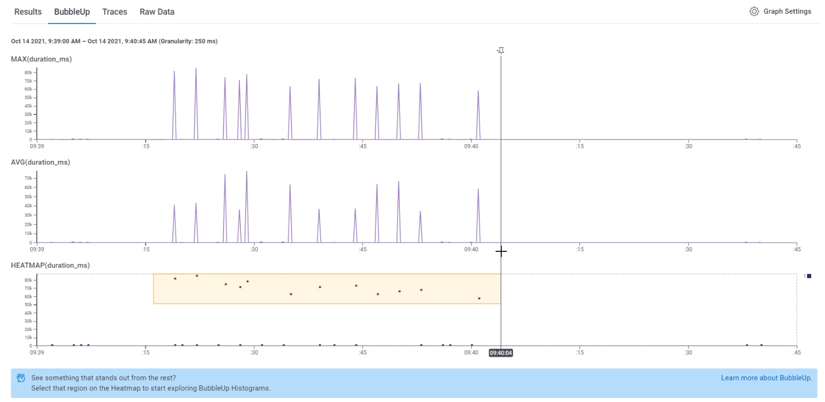
That will do some calculations for me and it will showcase to me what's happening for each of the fields inside that yellow box versus outside.
Things that are happening inside the yellow box are depicted in yellow lines and things happening outside are depicted with blue.
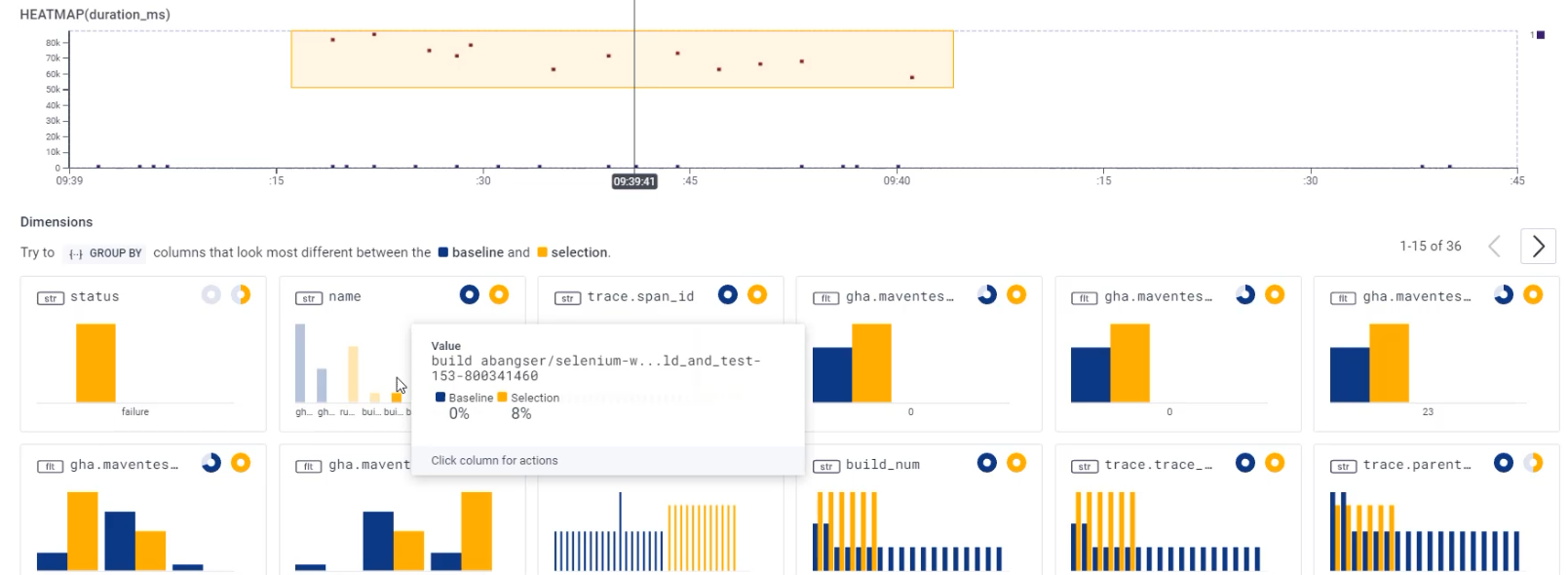
So I can see here that a lot of them failed.
We didn't have failure for any of the shorter running events.
I can also see that when I look at the name, the ones outside of the yellow box are 70% "gha-buildevents_post", and 30% "gha-buildevents_init".
But when I look at the ones inside the yellow box, I can see "run-maven-tests", I can see things around build_and_test that are for my specific project.
If we go back to our pipeline and we go look at what "gha-buildevents_post" is, that might give us some more information.
I'm going to open up GitHub and go to the "Actions" tab, and I'm going to open up any of these runs.
Inside of this run, I can look at the details and I can see that "gha-buildevents" is speaking about that third party tool that we are using in order to install buildevents.
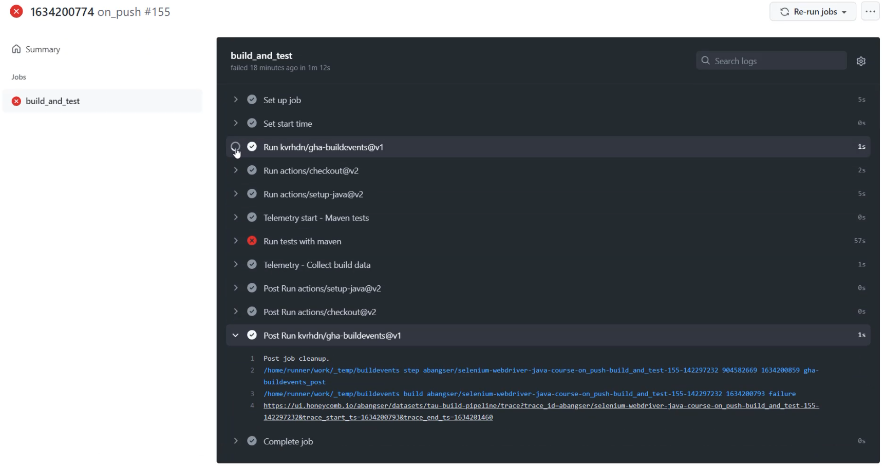
I can see that there's a "Post Run" here, and I can see that there's an initial "Run" here and it's talking about init.
I can even see that the event that it sends to Honeycomb calls itself "gha-buildevents_init" and "gha-buildevents_post".
Fantastic. I've been able to track down what is taking so long versus so short, and it makes so much sense.
The ones that are running our Maven tests are taking so much longer because those are doing the heavy lifting.
Let's return back to the Honeycomb page.
Here, I can now understand a bit better what's going on.
In the events world, I'm going to be talking about each and every event, not the pipeline as a whole, like I was in metrics.
# Smoothing out high cardinality data into aggregated data
There may be cases where I want to ignore certain things like third-party parts of the pipeline.
To do that, I need to collect these unique events into a bucket - I need to aggregate the data.
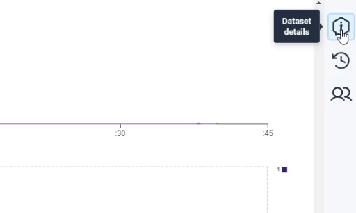
I can do that by going to "Dataset details" and going to the "Dataset Settings".
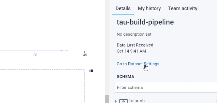
Here on the "Settings" page, I can see that there is a "Schema'' relating to this dataset.
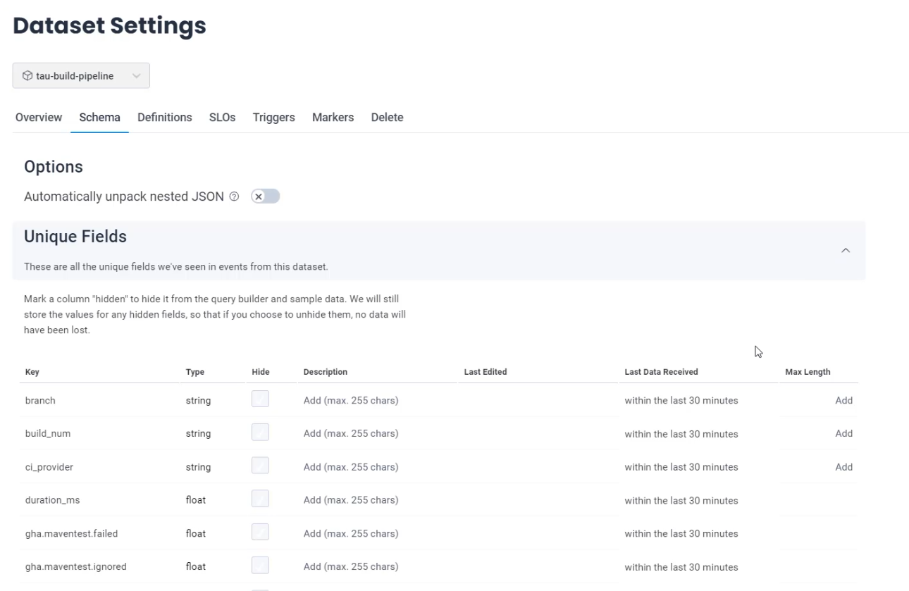
The unique fields exist, which are the fields which I have sent in, and you can see things like my custom fields there.
And, there's a derived column section, and this is empty as of now.
Derived columns allow us to build columns on the fly in the dataset, rather than needing to send them in.
When I add a derived column, I can add an alias and I highly suggest you start it with the word derived., to be able to kind of namespace all of these columns together.
From there, I'm going to call this derived.gha-3rd-party-events.
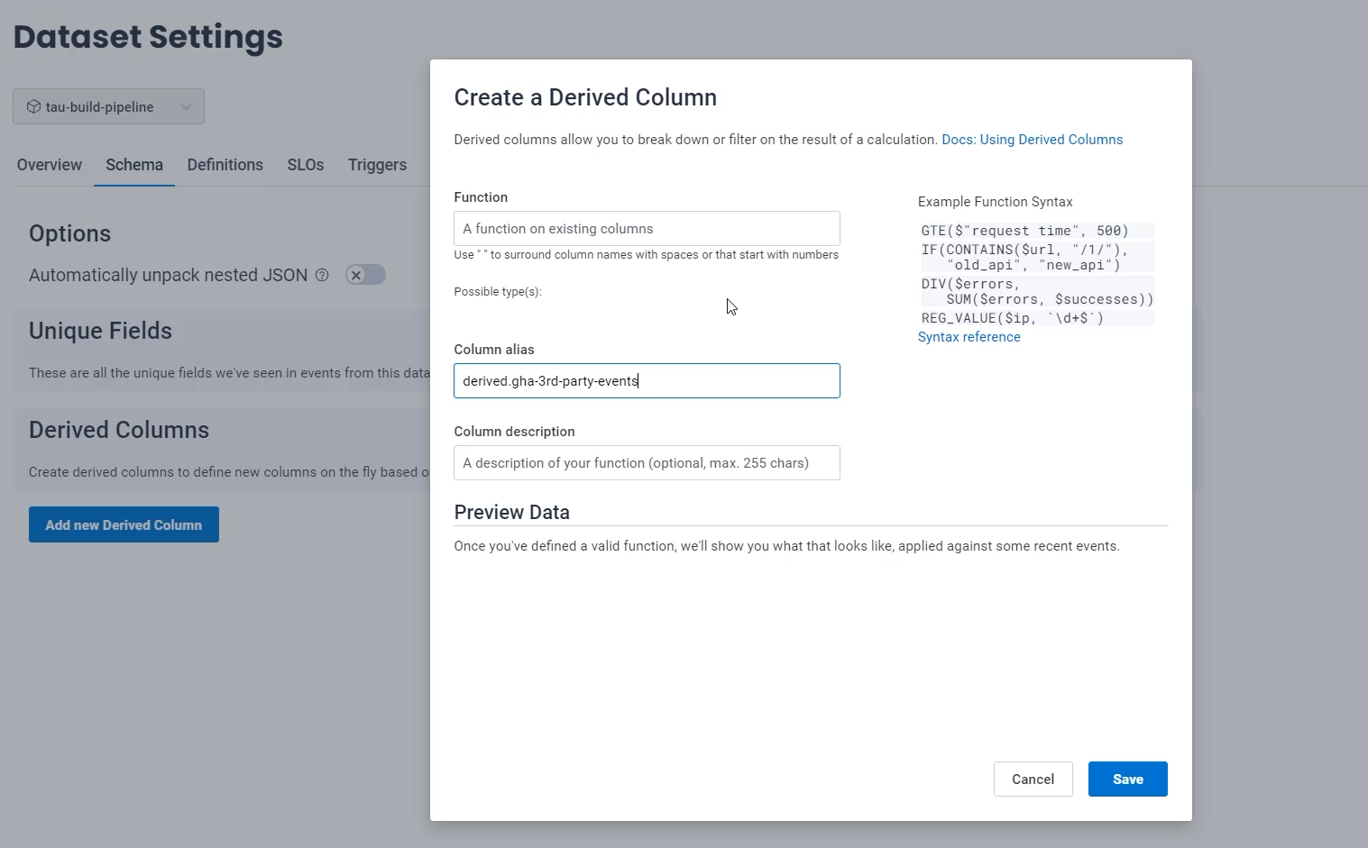
These are things which are coming from third parties that I want to be able to ignore, so I can add a description there.
Now I need to handle the "Function" - the function is what allows us to take data from other columns that exist and generate this derived column.
I want to collect anything where the $name field has gha_buildevents, so I'm going to say STARTS_WITH(), and I need to feed it the name of the field I want to be evaluating, which is the $name field and what it is I want to check if it starts with - and for me, it is gha_buildevents.
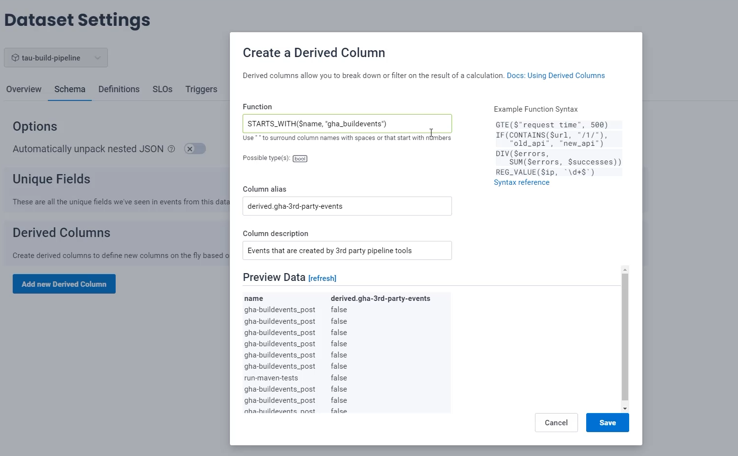
Once I click outside this box, it will evaluate that that equation is valid by putting a green box around it, and it will provide me with some example data to check my query.
I can see here that "gha-buildevents_post" has created a false when I would expect it to be true.
That's because I did gha_buildevents.
If I just switch this to gha-buildevents, I can now see the "gha-buildevents_post" is true and "run-maven-tests" test is false, which is exactly what I want.
What I don't see on here is any examples of the "gha-buildevents_init".
So I can refresh my preview data and see if an example of an "gha-buildevents_init" might come up.
This isn't perfect because you're only getting the data that they are pulling by random, so you may not get an example. \
You're going to want to test this in your dataset as well.
I'll try one more time and no, no examples with "gha-buildevents_init".
So I'm going to save this and check on my graph itself.
Now, what I'm going to do is I'm going to go to my "Query History" and I'm going to go to the most recent query to be able to go exactly back to where I was.
What I can do is I can "GROUP BY" the name field.
First thing I'm going to do is that, so that I can see all the different field names that exist, including "gha-buildevents_post" and "gha-buildevents_init".
Now, I'm going to exclude my derived column - which, this is where it's helpful to have that namespacing - and I'm going to say "WHERE" derived.gha-3rd-party-events = false.
If I run this query and I scroll down to a table, I can see that now I don't have any of those build event fields.
The other thing you can see here is that we have some fields that have unique IDs.
For example, the build field has the run number and a random ID at the end, but you may want to be able to compare all of these together.
This is also possible with derived fields and is an activity that you can try out on your own using the regex value function.
With that, we've been able to look at how pre-aggregation affects the reality of data visualizations, and also look at a high cardinality data investigation where we track down what was happening with the slower build events.
In addition, we smooth out that high cardinality data to allow us to remove the third party actions in an easier way.
This is really just the beginning of your adventure with exploring how events can help you understand and explore your systems.
I wish you the best of luck and please reach out with any questions and learnings that you have.
This is a journey that we're all on together.